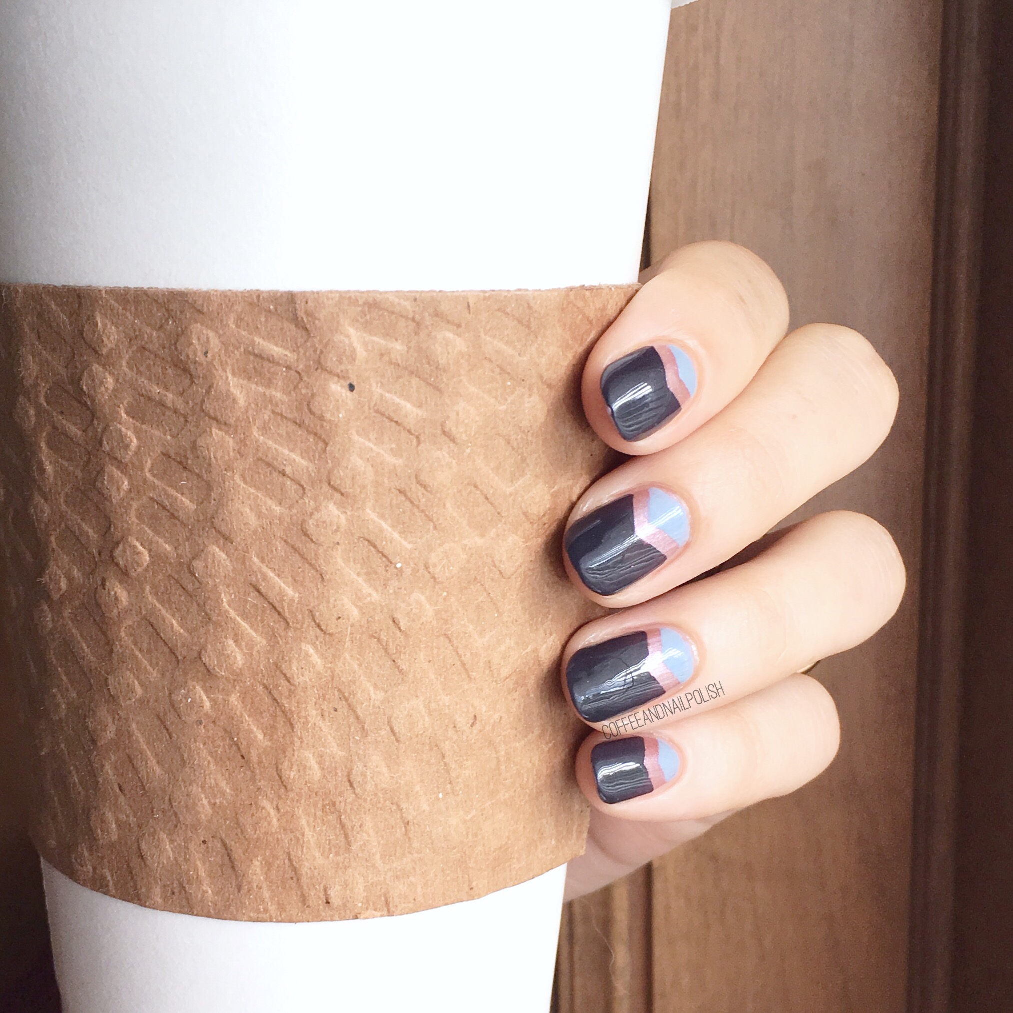
 Good Morning lovelies. It’s my favourite day of the week (& not just because the Mr takes Little Bubs to watch cartoons so I can sleep in!)… it’s Swatch Sunday. & it’s so exciting that I actually had to break it up into two days because I have the entire OPI Fall/Winter 2017 Iceland Collection to share with you. I’ve been obsessing about Fall shades for a few weeks now, so it makes me so excited to get to show off some finally!
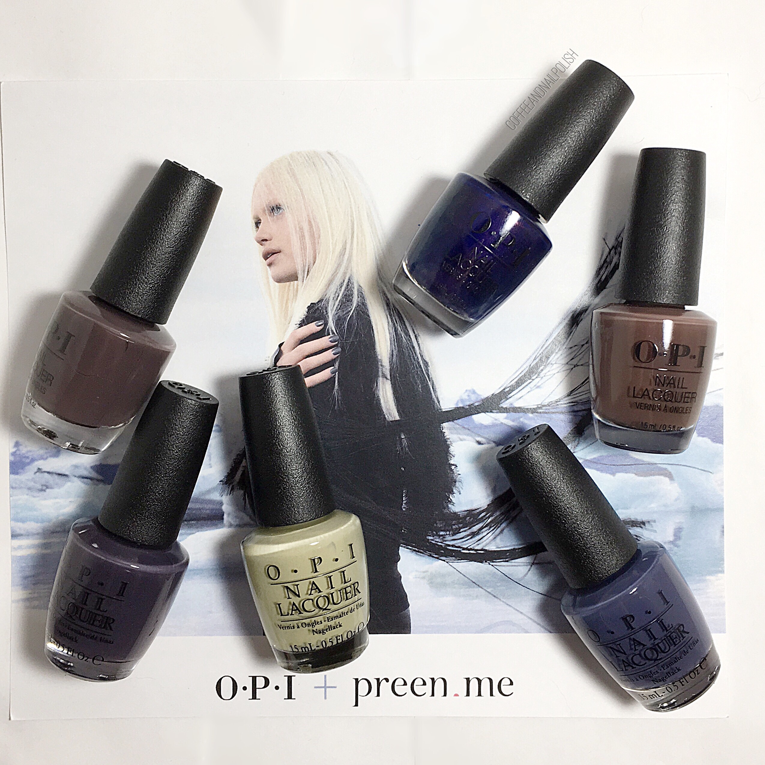
All of these lovely polishes were all gifted to me by OPI as part of the #PreenMeVIP program, as well as OPI’s natural base coat & top coat which I used for all swatches!
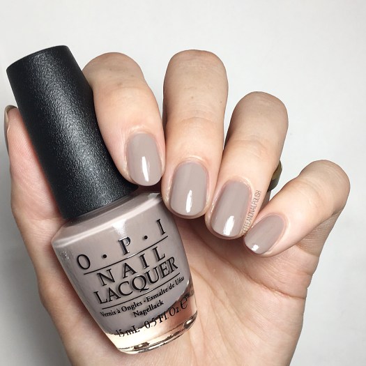
Icelanded a Bottle of OPI
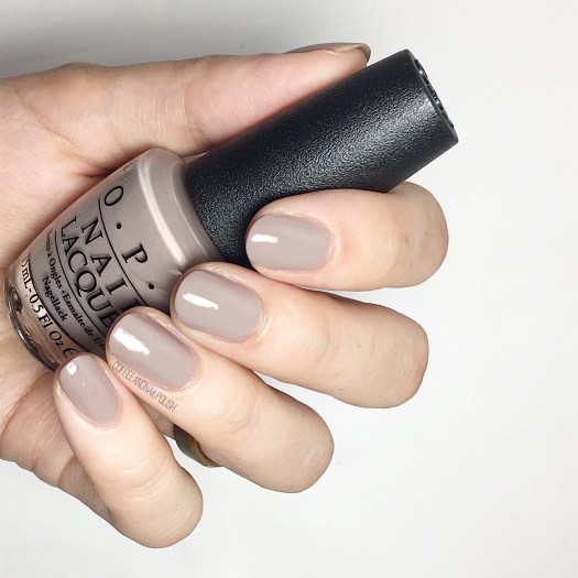
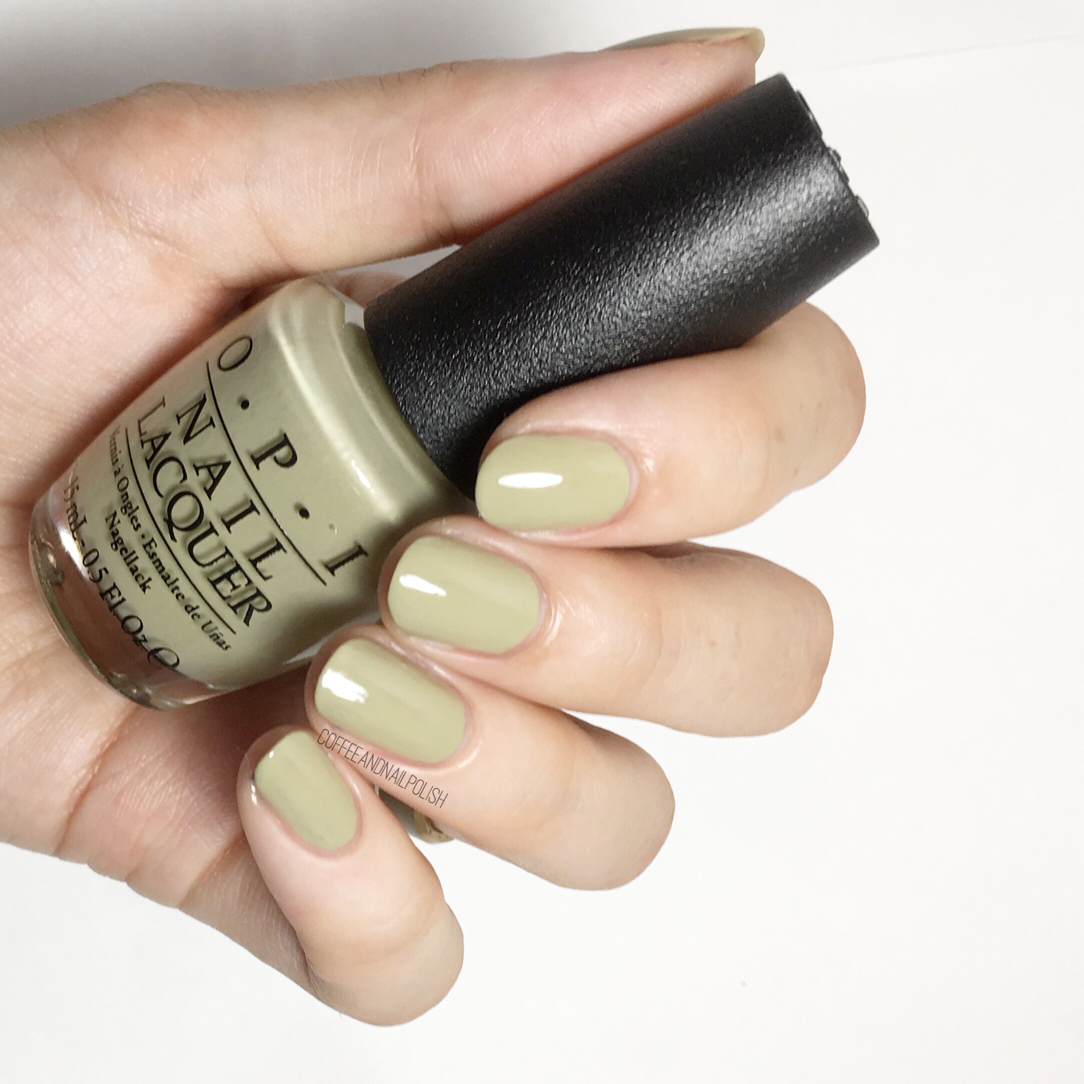
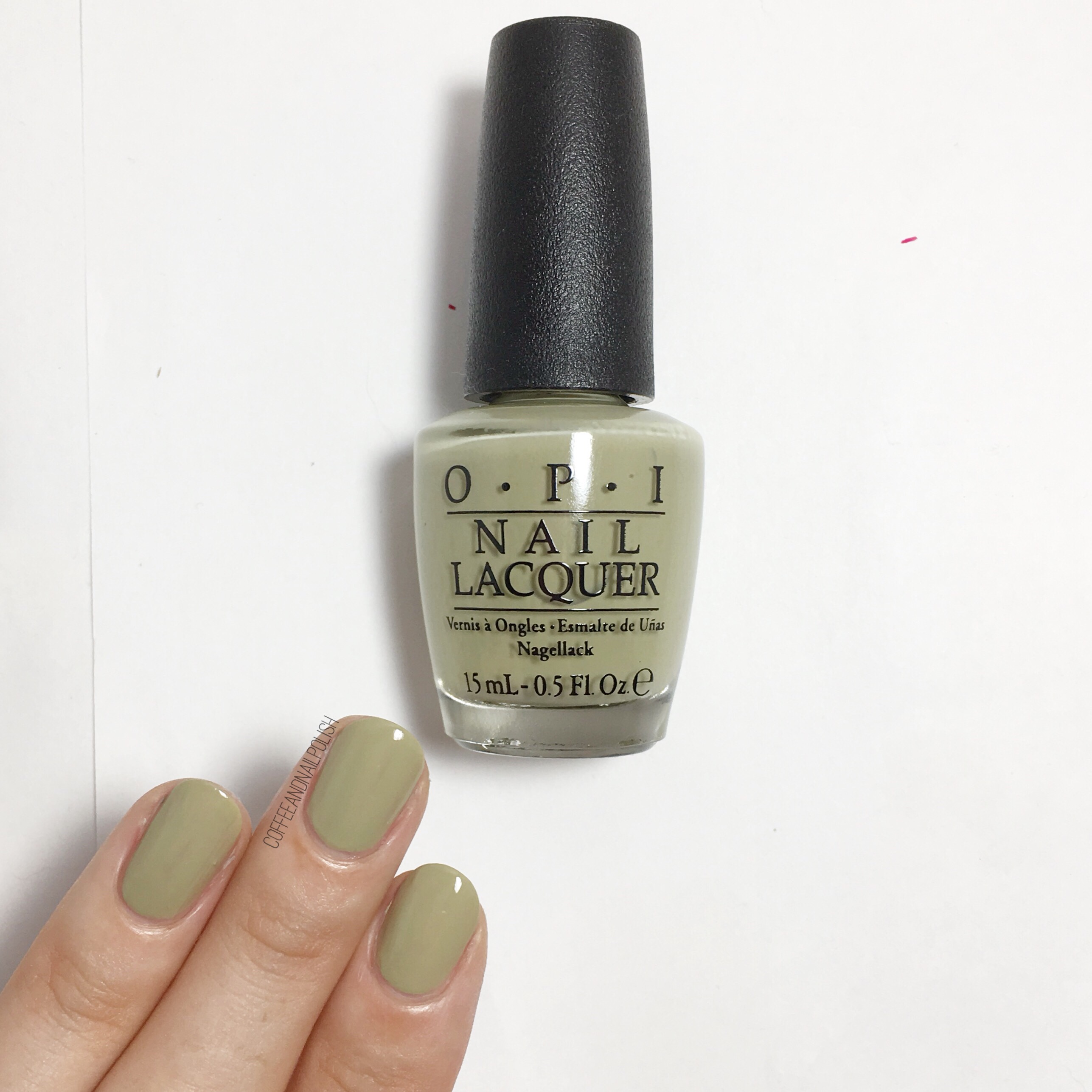
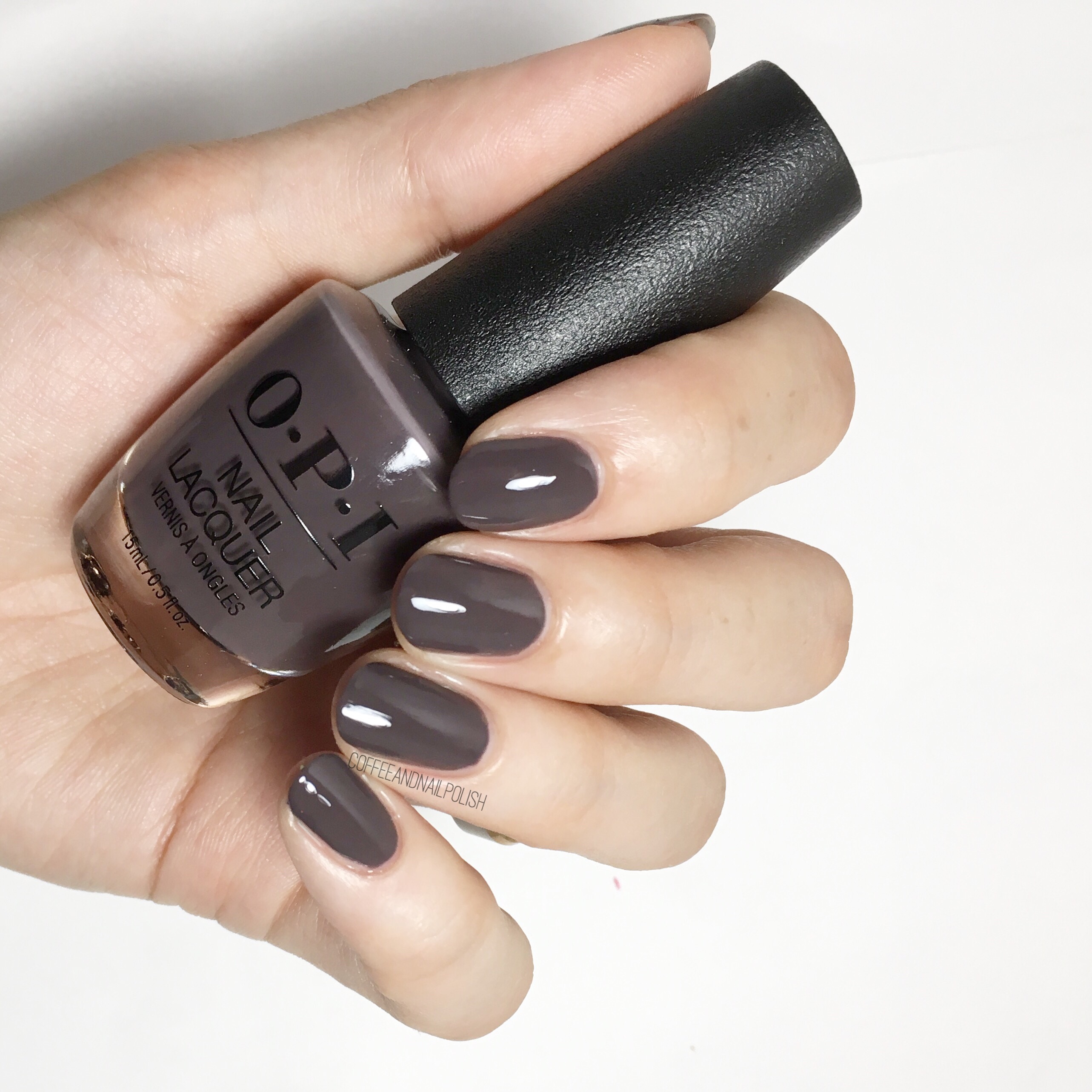
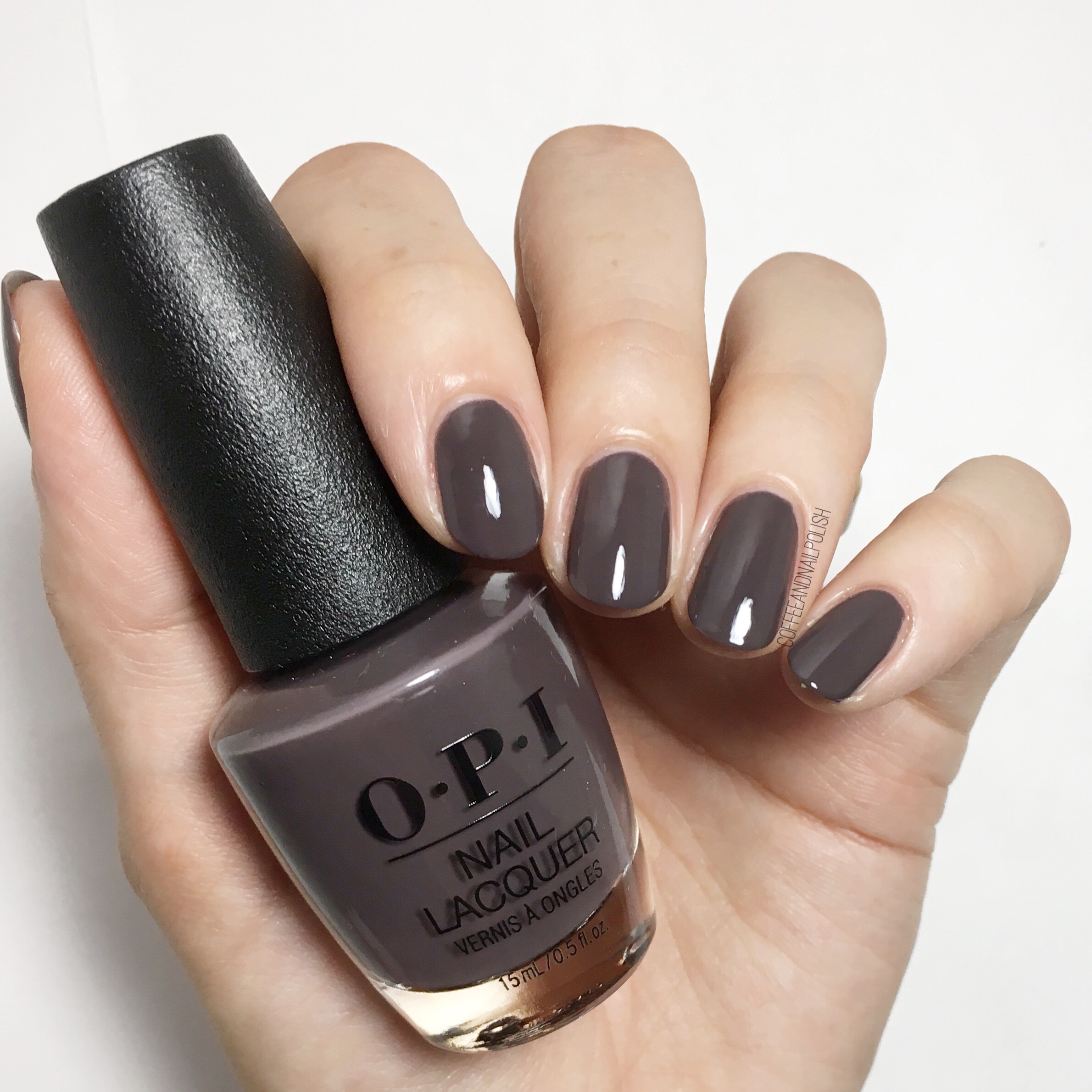
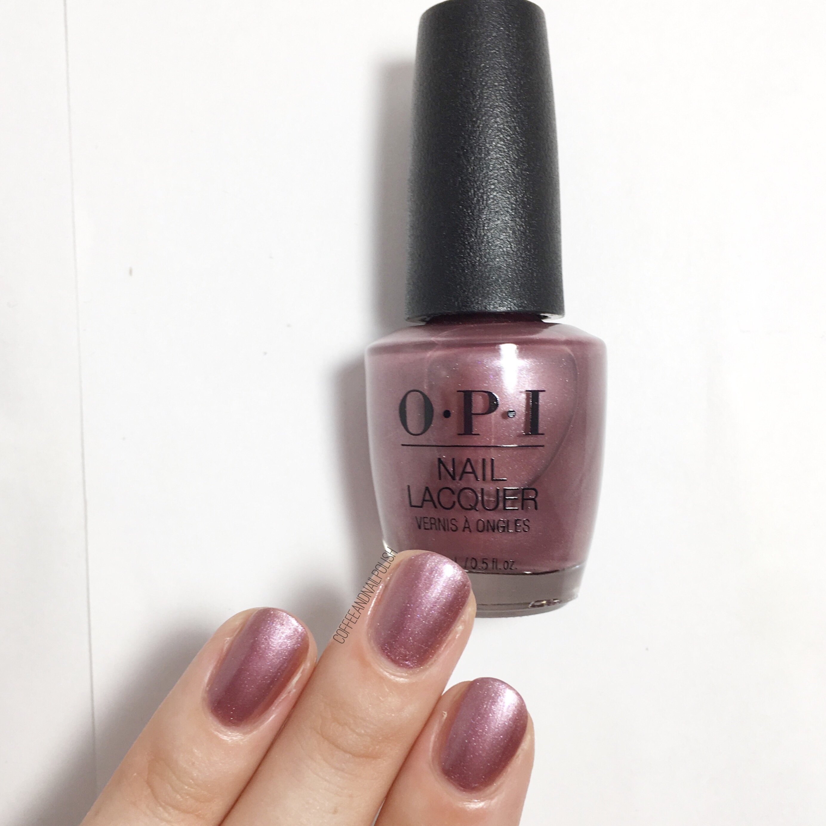
Okay I’ll be the first to admit this kind of shade is not my usual go to polish grab, but once I put it on I really liked it. & as far as a Fall shade, this taupe-y brown is perfect. This was two coats, & the formula dried down really nice. If someone was looking for a great neutral shade that was office appropriate but not a simple nude, this would be a great choice for them!

I’ll Have a Gin & Tectonic

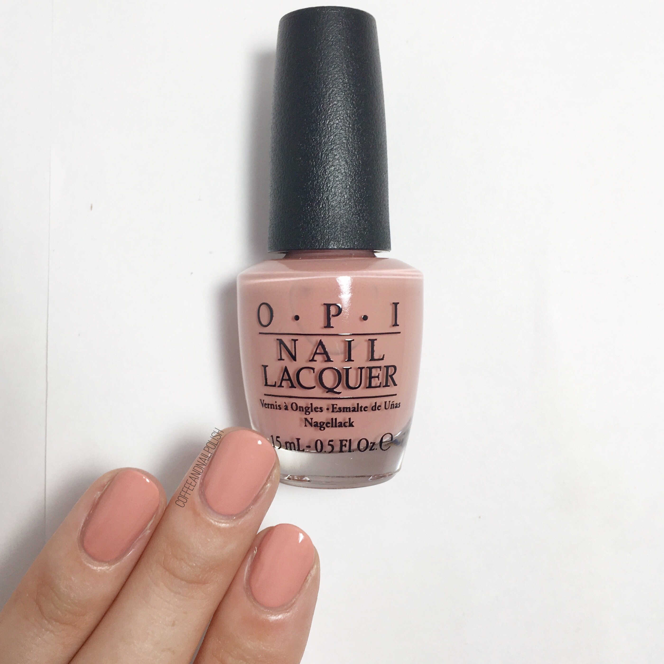
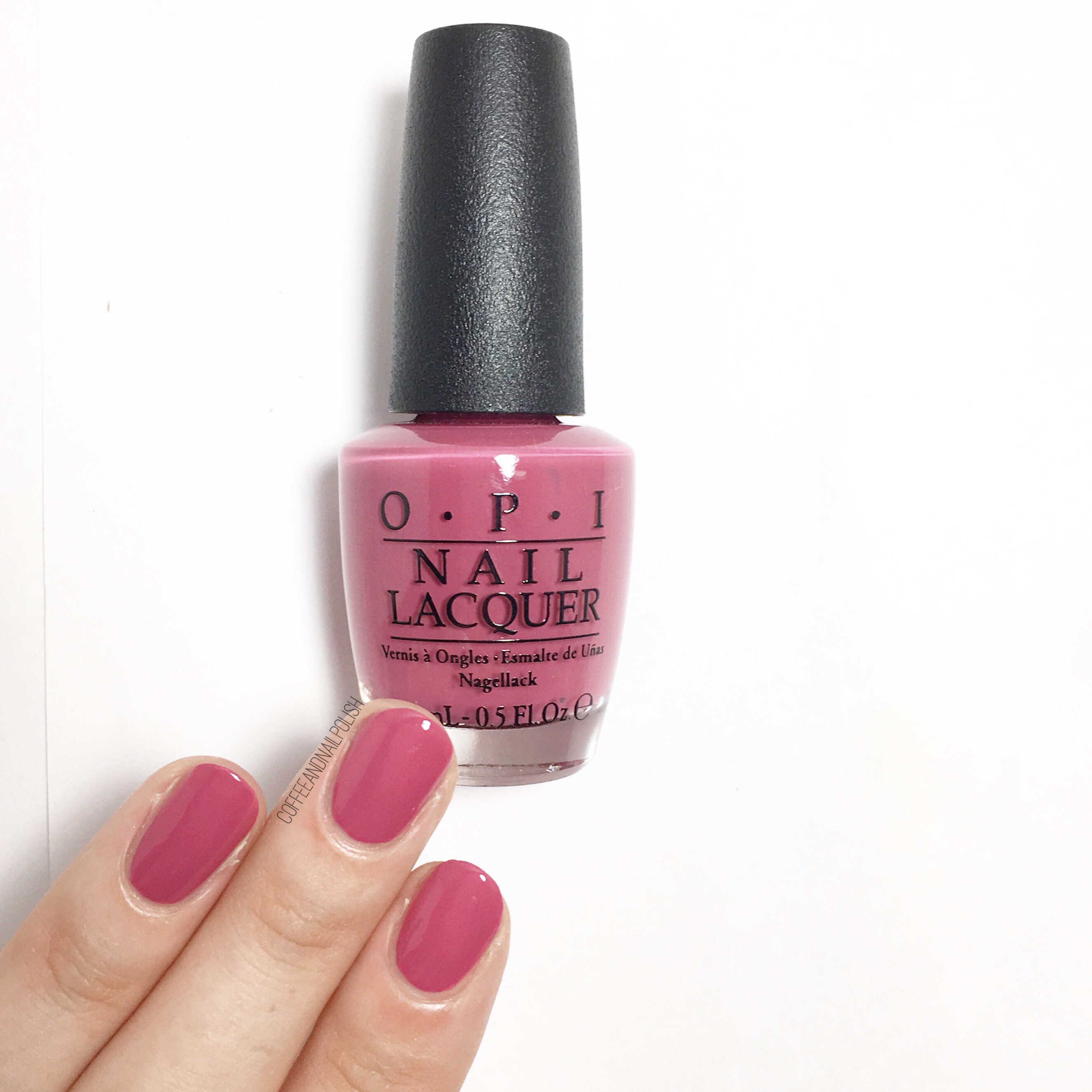
Oooooh this pink leaning peach shade is very pretty. & it definitely brings out the yellow/olive undertones in my skin. It took 2 coats to opacity & top coat is a necessity to avoid any streakiness. It’s a gorgeous shade, although I do think more Spring than Fall when I see it. Paired with one of the darker shades in the collection in a half moon or chevron moon & I bet it would look lovely & more Fall appropriate!


Reykjavik Has All The Hot Spots
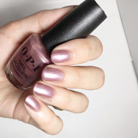
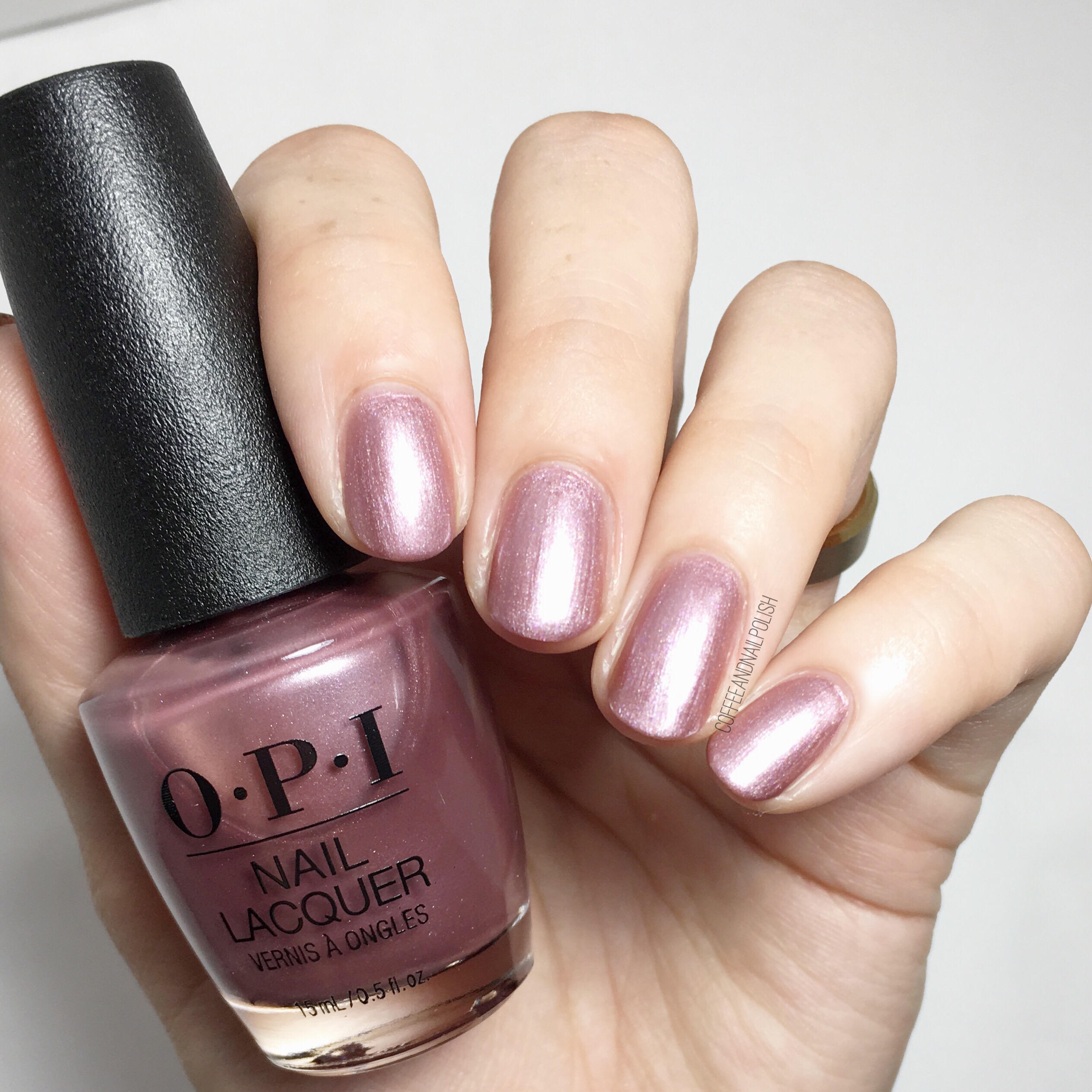
Hello frosty pink rose gold perfection. Whatever you want to call this shade, it’s very pretty! It’s also 3 coats which I’m okay with because of the end result. There are some streaks but I feel like that’s part formula & part my lack of carefulness. This one definitely feels very Fall to me & even though it’s been forever since frosted polish was part of my collection, I can definitely see myself featuring this shade a lot this season!


Aurora Berry-alis
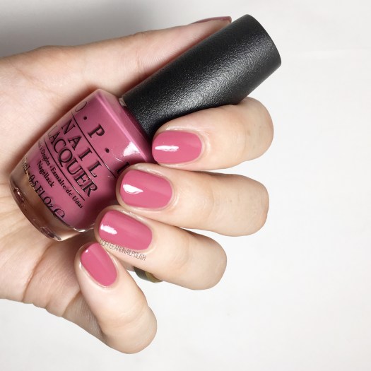
You know sometimes when you see people posting swatches of a shade & you think it’s so pretty but figure it can’t possibly look that beautiful in real life? Well this berry shade is actually as gorgeous as it looks. It’s slightly dusty but rich at the same time. I used 2 coats for my swatches below. It’s juicy & the formula is flawless & I never wanted to take it off. Expect to see me wearing this shade a lot this Fall! (Definitely going to need a back up bottle!)


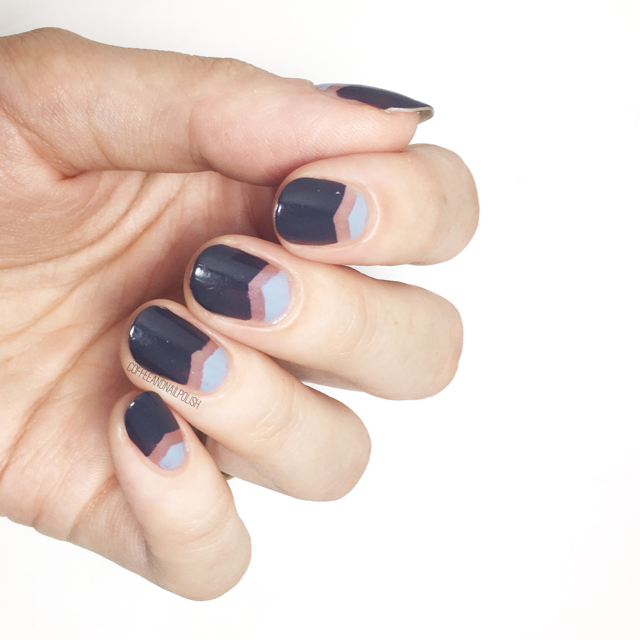
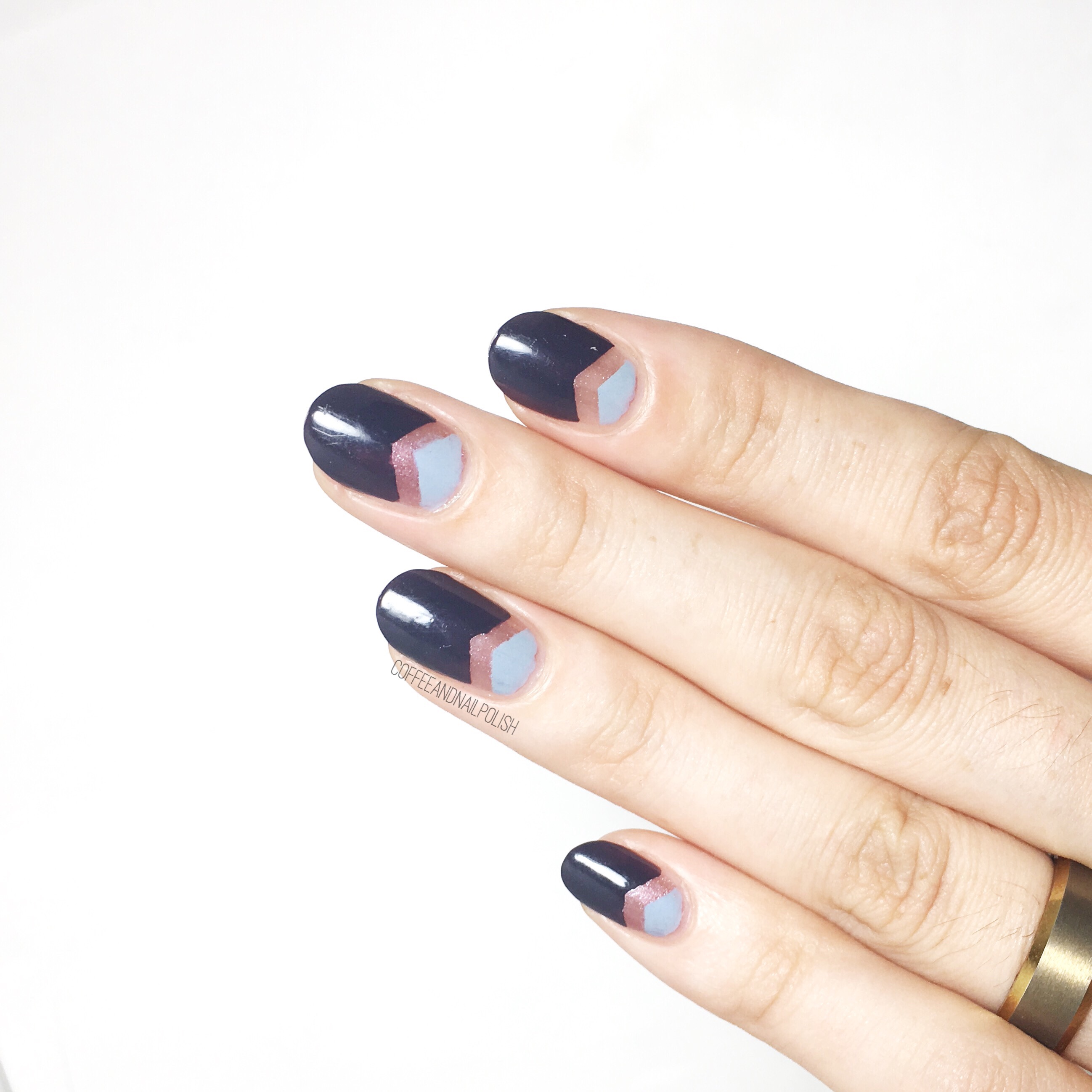
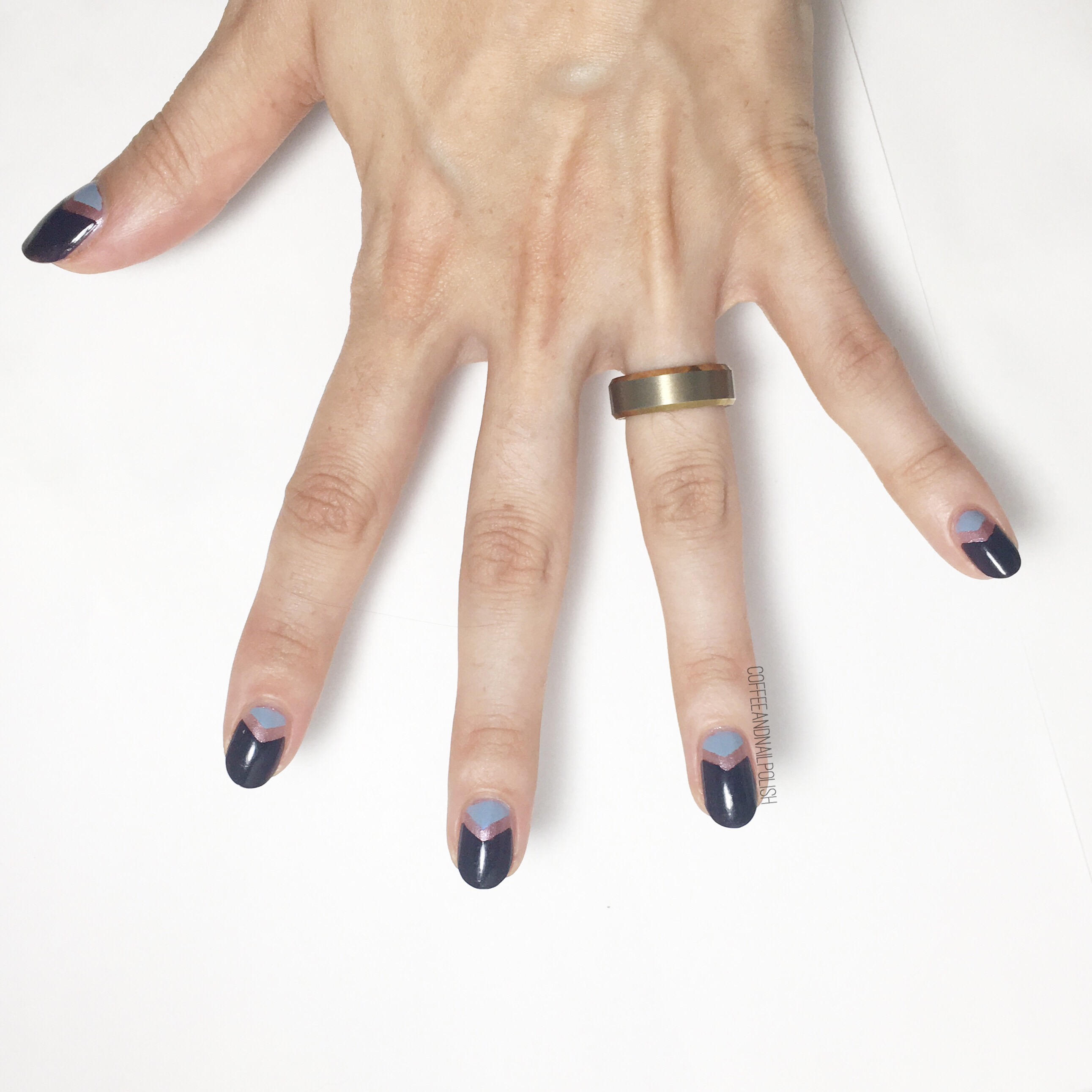
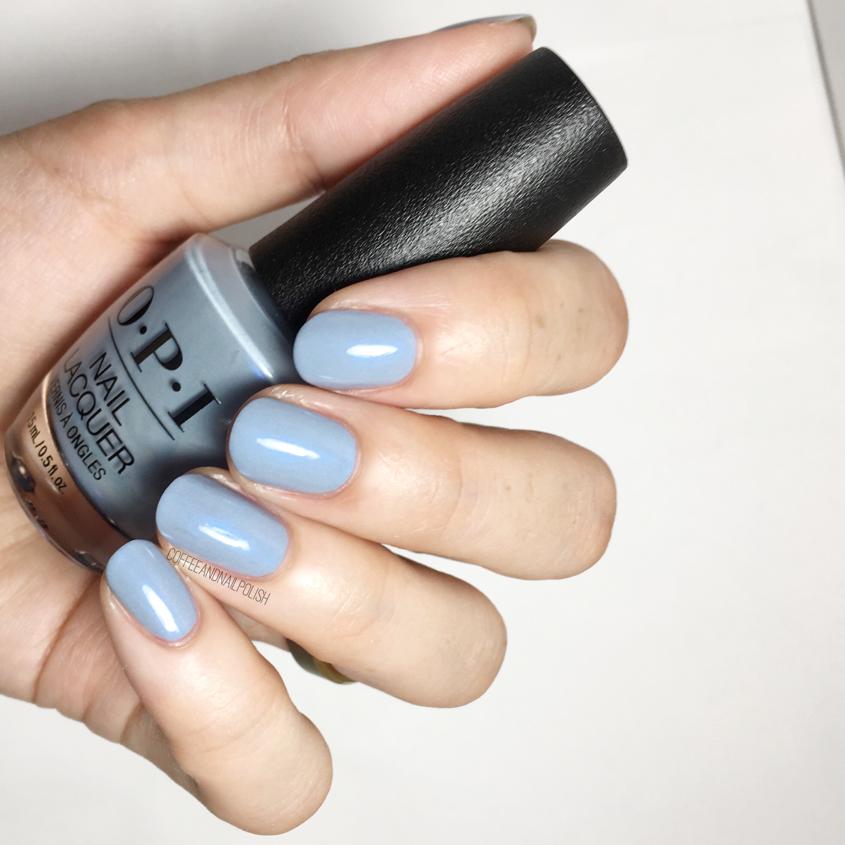
Check Out The Old Geysirs

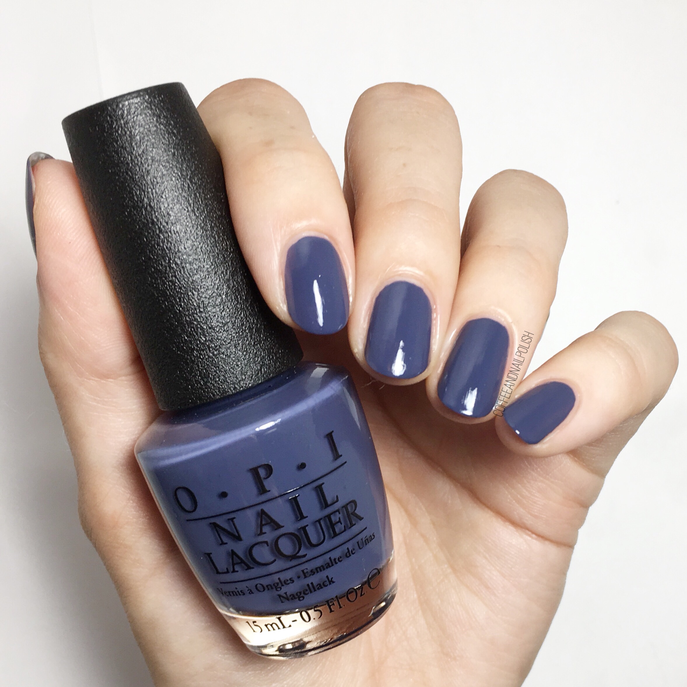
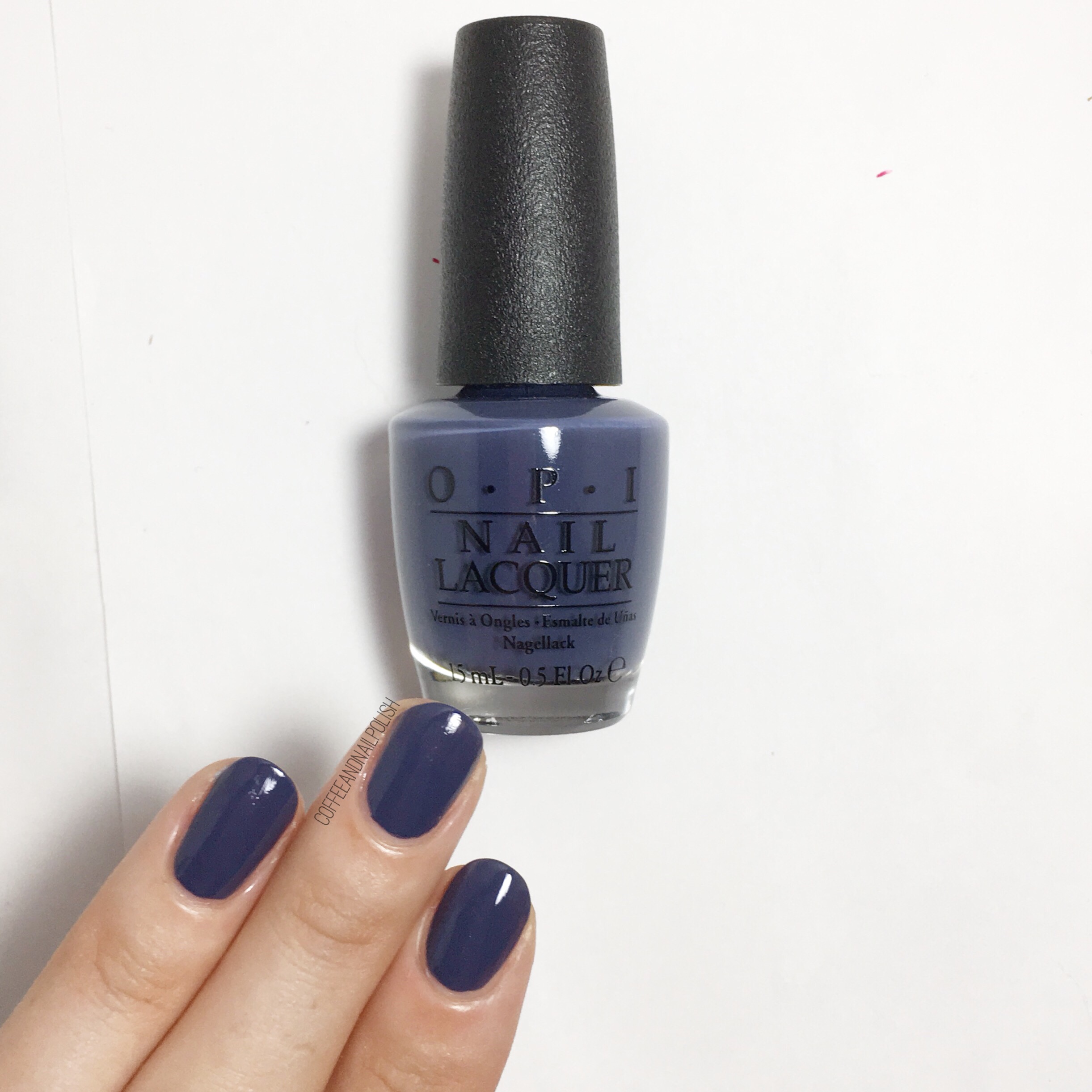
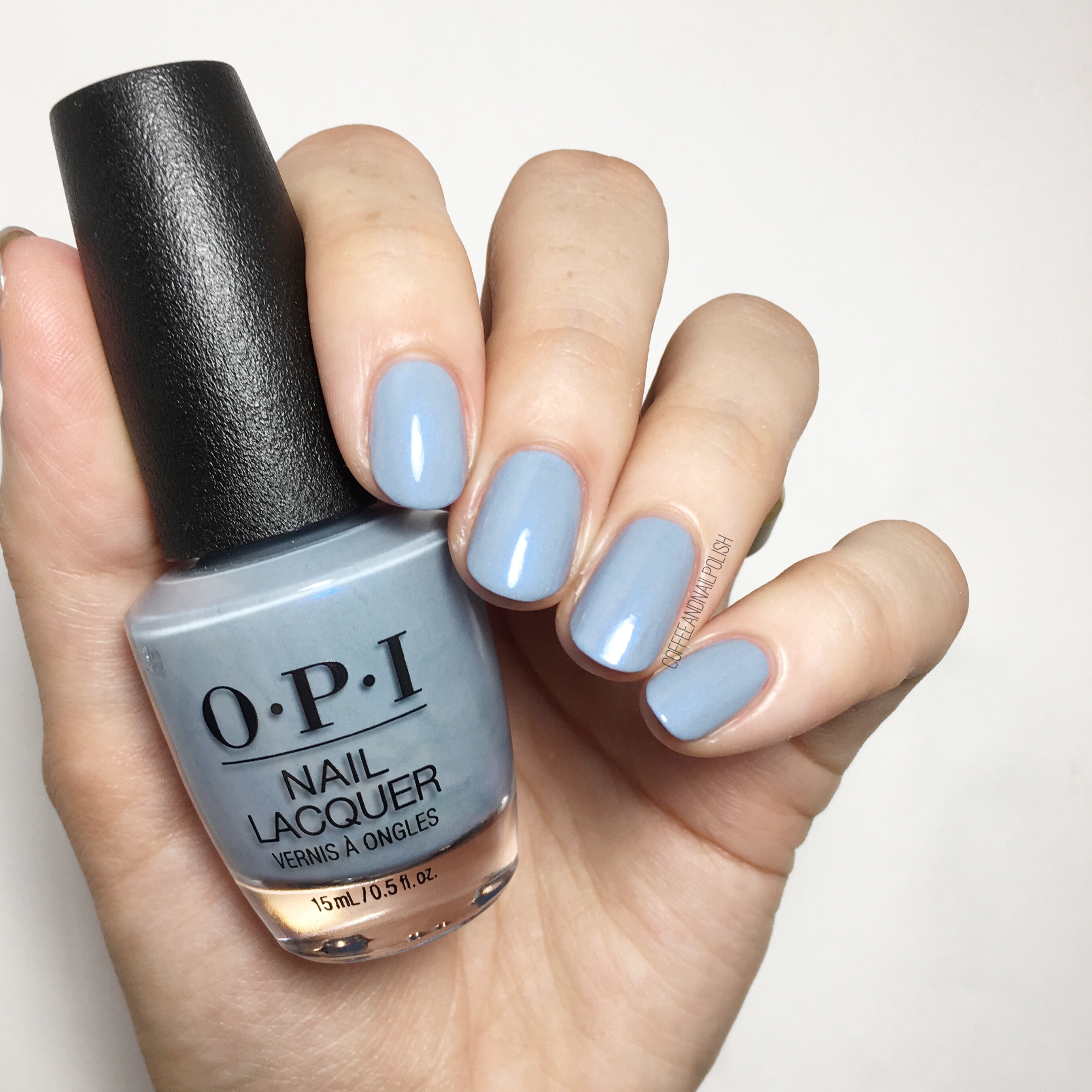
Now this shade screams Iceland! For my swatch, I needed 2 coats of this greyed blue for full opacity. I was quite impressed the shimmer showed up on the nail as well as it showed in the bottle. It gave a little extra pop on the nail! You know how much I love a good blue shade, & this shade was very very pretty. Reminds me of icicles!


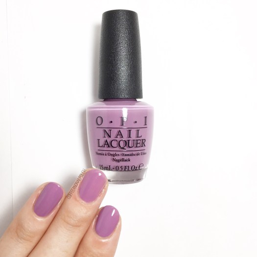
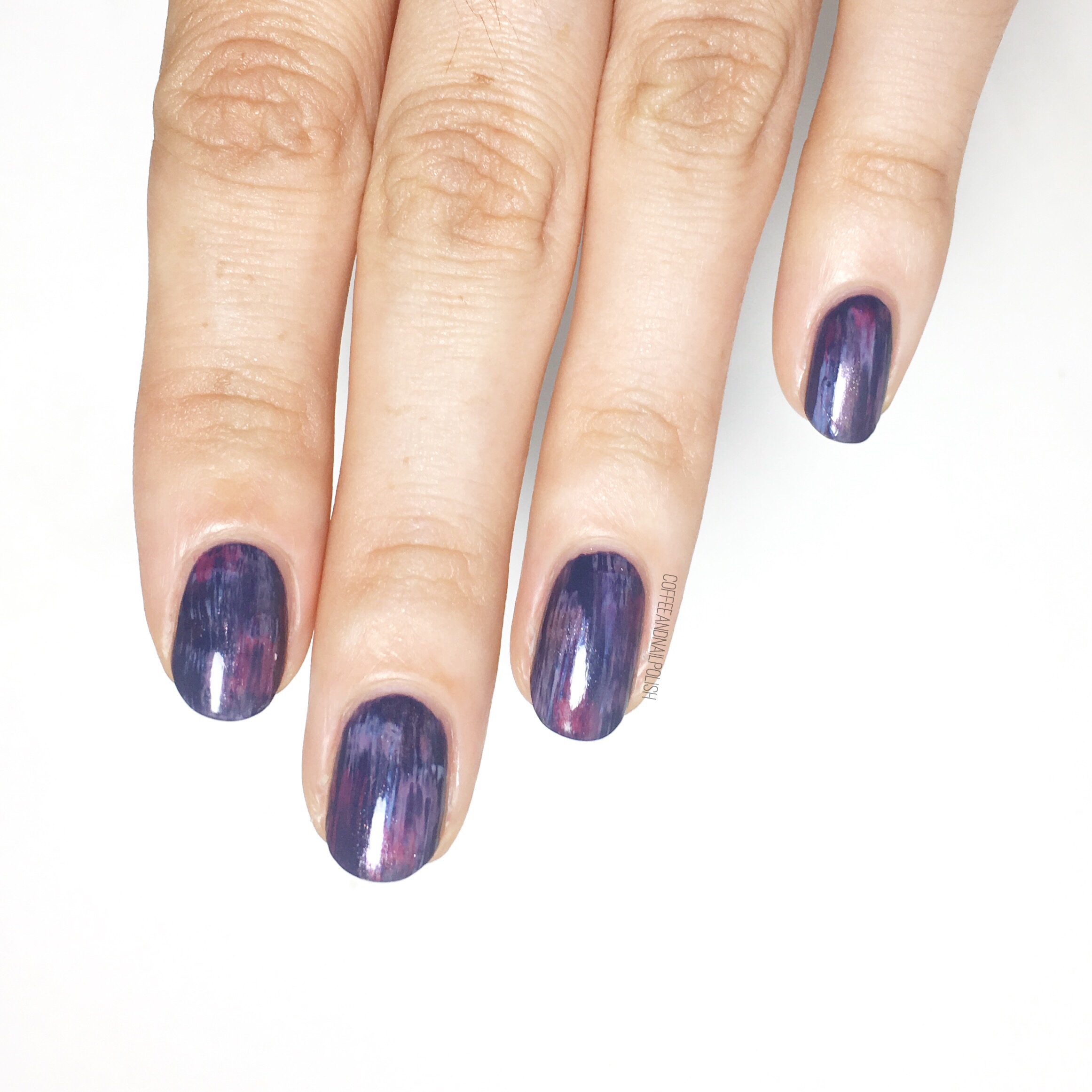
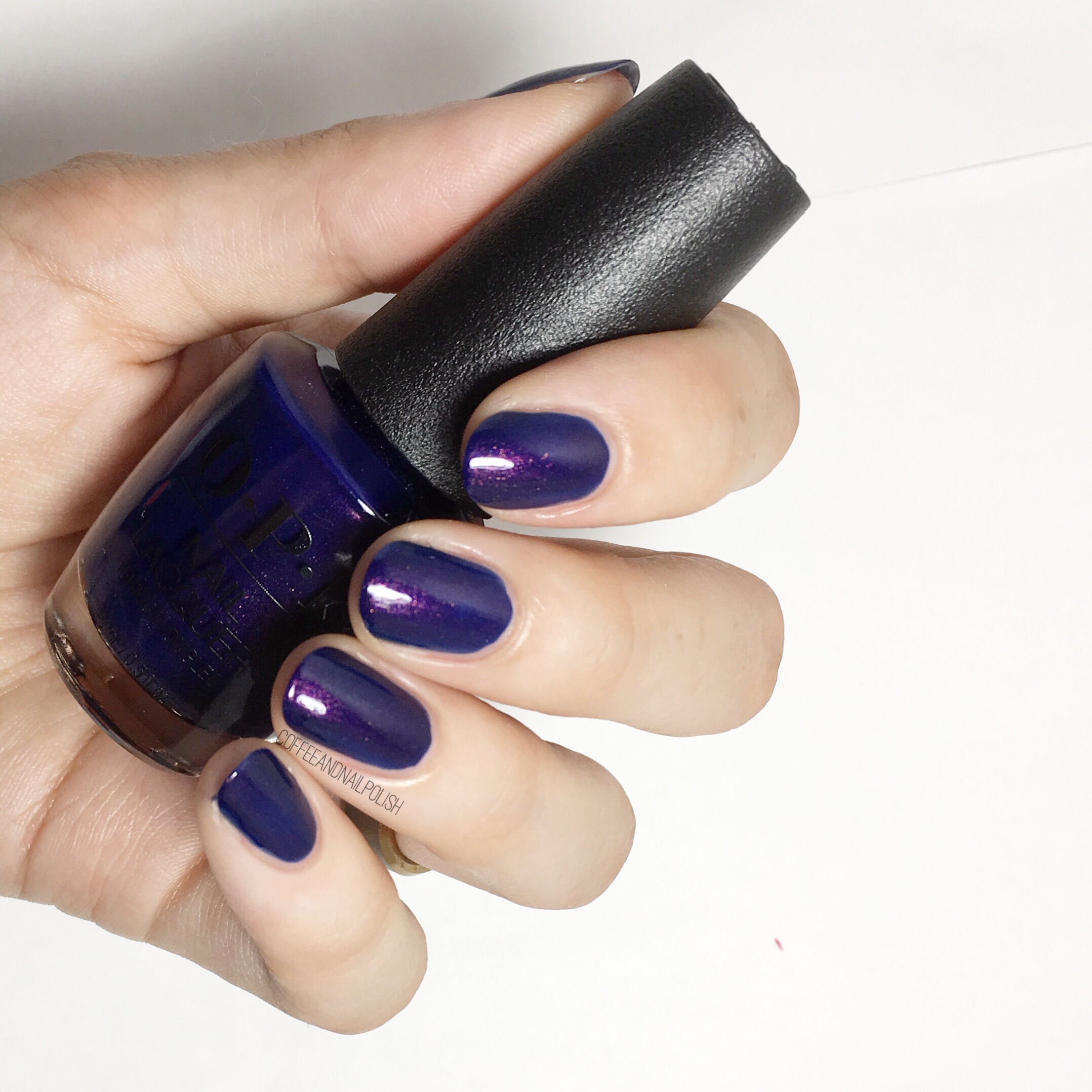
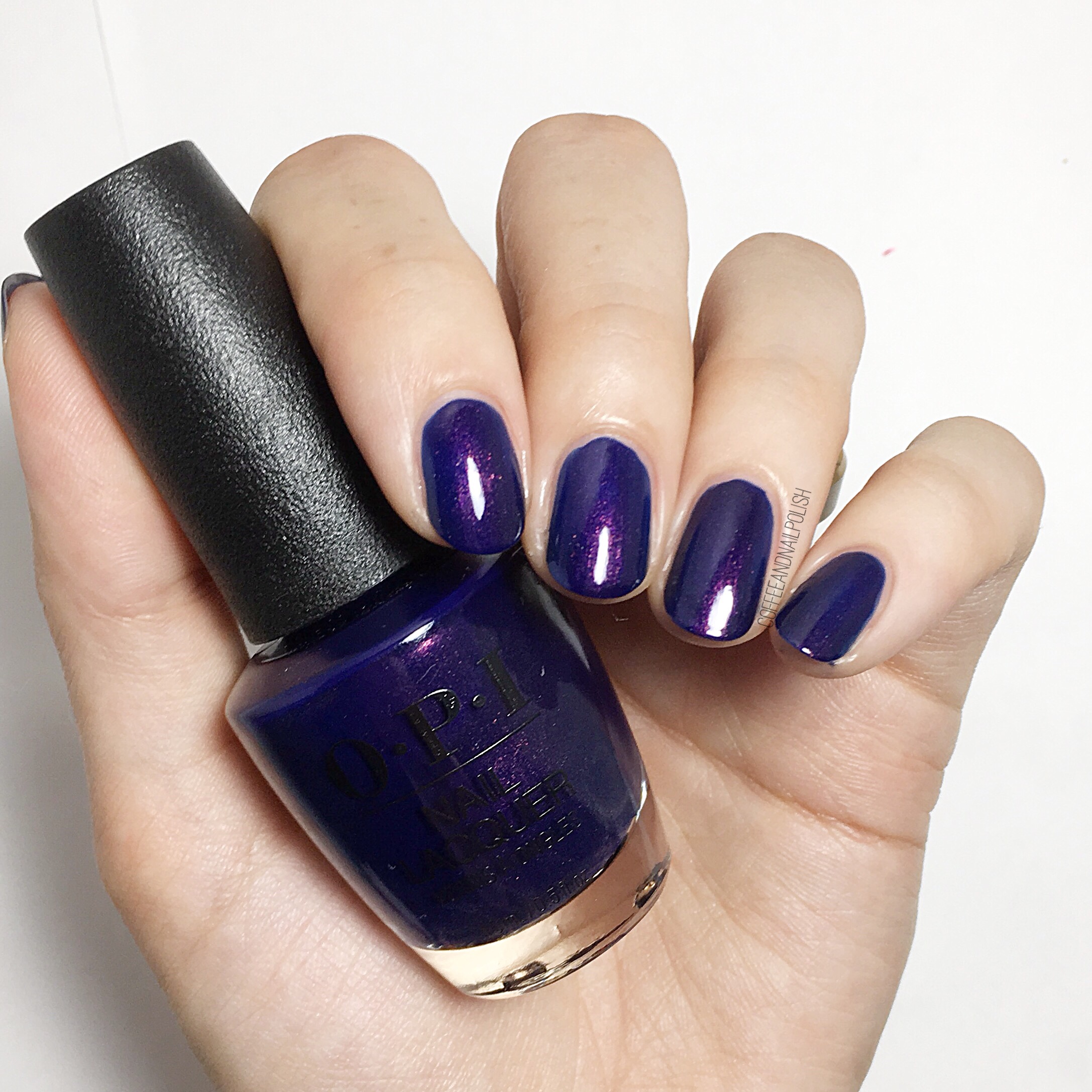
One Heckla of a Color!

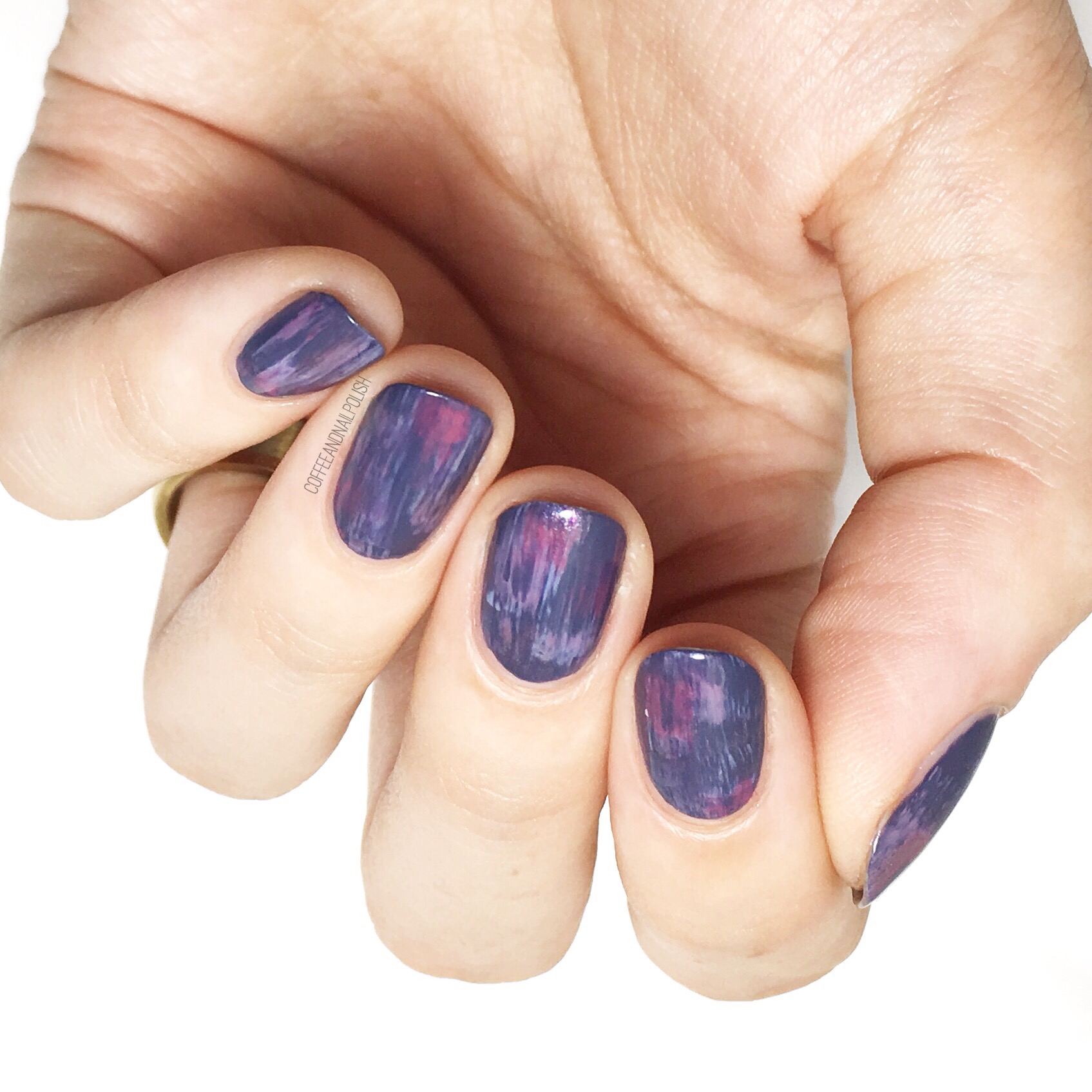
& finally for today’s swatches we have this 2 coated purple creamthat as you can see dries slightly darker than the bottle colour. OPI describes this shade as a “frosty purple” on their site which I would necessarily agree with the frosty part, but it does have that little bit of underlying dusty-ness to it that a lot of these shades have that works really well to bring the whole collection together.

& that’s it for today? What do you think of the OPI Fall/Winter collection? Any favourites you see already that you have to have? Let me know your thoughts in the comments below!
I hope to have part 2 of the collection (the much darker shades!) up either tomorrow or Tuesday!


