SWATCH SUNDAY — Sally Hansen Complete Salon Manicure Berry Fancy

Good morning lovelies & happy Sunday. Unless, of course, you to where in the path of Hurricane Fiona & are also still in the post storm darkness. I come to you, from my the front of our car where I am simultaneously charging my near dead phone, & using it as a hot spot so I can write up the blog post!

Haha, Hurricane or no, the show much go on.

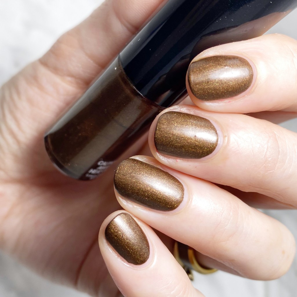
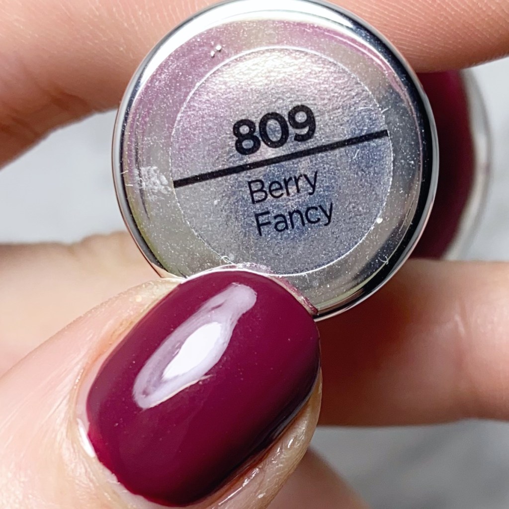
Today I reached into my stash for another pretty shade from a few years ago: Sally Hansen Complete Salon Manicure in Berry Fancy. This shade was originally released as part of the Sally Hansen Red/esign collection circa 2018, & was gifted to me from Sally Hansen in a super cute package. At the time, I was newly pregnant with my daughter (& sick all the time) so I only swatched 1/2 the collection. You can find those shades HERE.

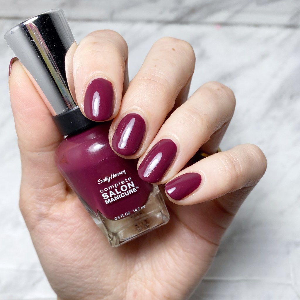
2 coats + Sally Hansen CSM Fast Dry Top Coat

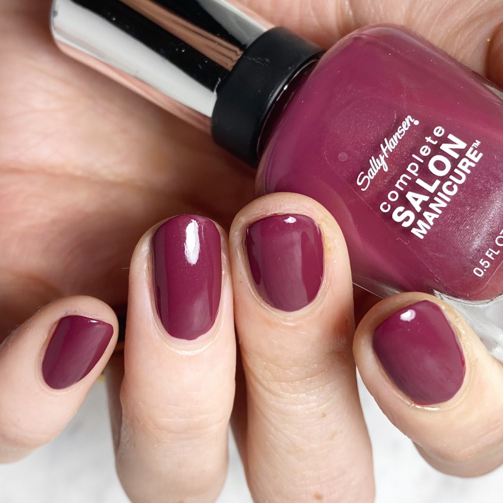
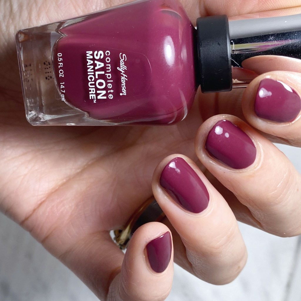
The formula on this shade is quick nice. It’s not a one coater, which would be nicer, but it does apply absolutely perfectly in 2 coats, & leaves a thick glossy finish, even before applying top coat. The colour itself is a beautiful dusty brick red, that leans a bit more berry side of things. It’s a nice change up, & definitely is 100% an Autumn shade.

Again, the application was really nice, & I like that this is a not quite red kind of shade. It’s kind of like a mix between a dark dusty rose, a brick red, & like… maybe plum? Either way, it’s a fantastic edition to my red collection, because sometimes you get a little bored with just fire engine red, you know?

This is also the shade/colour I’ve been heavily debating adding to my hair where I have it coloured. Currently it’s a not so great, extremely faded, purple-y pink colour, so I’m thinking it would be nice to go with something definitely for the ‘Ber months… since they are my favourite months, after all!

I peeked online, but it doesn’t look like Berry Fancy is still part of Sally Hansen’s regular core collection. I did find one bottle listed on eBay, used, but other thank that it doesn’t look like its an easy shade to track down. That being said, I feel like this shade probably has an easy dupe out there, so if you’re looking for a red/not-quite-red shade like this, it won’t be hard to dupe.

Let me know what you think of this shade, & have a wonderful day. Time for me to finish my camp stove made coffee, & pray we get some power soon! Have a lovely day darlings!

Bronze-y Abstract Stripes (Featuring OPI)

Hello lovelies & happy Tuesday. It’s a rainy Tuesday here — in fact it’s supposed to be rainy all week, capping off with a potential Hurricane on Saturday. So that’s… fun. We’ve had such beautiful weather the last few weeks, I think I got spoiled, because I am not here for rainy days.

But! I have a fun nail art look to share that I wore last week during sunnier times. I was feeling some Autumnal colours, & decided to pull a few beauties from my OPI display to create this fun abstract stripe look. It’s giving me 70s vibes.

The polishes I used for this manicure are: 

  • Base Coat: Essie Hard To Resist Glow & Shine 
  • Top Coat: Sally Hansen Complete Salon Manicure Fast Dry Top Coat
  • OPI I’ll Have A Gin & Tectonic
  • OPI Bronzed to Perfection
  • OPI Icelanded A Bottle of OPI
  • OPI I Sing In Color
  • NailStuff.ca 16mm Striper Brush

How fun are these!? Obviously, with my super short nails, I’ve been struggling a bit on inspiration, but abstract stripes always make me happy to paint my nails. Plus these colours look awesome together. Thankfully, my middle finger nail is finally growing out enough I can shape it to match the others.

What do you think about this abstract stripe look? Do you think this colour combination is as fun as I do? Let me know all your thoughts down in the comments below, & share what you’re wearing on your nails right now!

SWATCH SUNDAY — Giorgio Armani Nail Polish in Woodstone

Hello lovelies & happy Sunday! I hope everyone is having a lovely weekend so far.

Today I decided to dig deep into my stash, & pulled out a polish that was gifted to me back in 2015, & has been sitting in there, peaking my interest, for a long time. This is Giorgio Armani #214 Woodstone, which was originally released as part of the Fall 2014 Fade to Grey Collection. At least — I’m 99% sure this is #214 Woodstone. Mine didn’t have the official name on the bottle, but after some Googling, & seeing other swatches, it’s pretty clear that’s which shade this is.

2 coats, no top coat.

First up, this shade is such an unusual colour selection for me, but I was really really feeling this bronze-y brown shade, that I had to put it on. It’s such a deep, dark brown, but the gold shimmer really gives it another depth to it. For my swatches, I applied two coats of polish, but honestly it was pretty much opaque on the first coat, the second one was just to smooth things out fully.

Also, I really like the way the golden shimmer looks with this shade. With the matte finish, it really does almost give you the effect of being wood grain, which is really cool.

Just for fun, I wanted a comparison of the polish both matte & glossy. Top coat definitely takes it to a whole other level — I just love it!

I’m really loving this shade, & kind of sad it’s taken me 7 years to actually venture out of my comfort zone & try it out. It really is a stunning shade for Autumn & Fall. All is missing is a little bit of golden accent, maybe some leaves. A fantastic base for an Autumn inspired nail art look!

Sadly it looks like Giorgio Armani Beauty no longer produces nail polishes, which is a shame. If I had known how nice of a formula their polishes had, I definitely would have sought some out sooner. However, I’m glad to have this beauty in my stash, & I definitely won’t be waiting another 7 years to wear it again!

What do you think about this pretty bronzed brown? Do you ever wear brown nail polish? Do you prefer it with a matte or glossy finish? Let me know all your thoughts down in the comments below!

Dainty Grey Dotticure Accent Nails

Hello lovelies & happy Thursday!

I hope everyone’s week is going swimmingly so far. It’s almost the weekend! Today I’m showing off a pretty, easy & dainty nail art look that I wore recently.

As you might have noticed, I have been rocking short short short nails lately, thanks to a break on my middle finger nail, & I’ve been waiting (impatiently) for it to grow out. So it hasn’t left me super inspired when it comes to painting my nails, which I think has been showing. However, you know what always looks good? Polka Dots!

The polishes I used for this manicure are: 

  • Base Coat: Essie Hard To Resist Glow & Shine 
  • Top Coat: Essie Gel Setter
  • Essie Merino Cool
  • Essie Cocktail Bling
  • Essie Mosiac On Down
  • NailStuff.ca Dotting Tool Trio

What do you think of this colour combination on this dotticure look? I love grey on grey, & I thought it would be a perfect Fall transition look. Plus the little hints of gold are a nice touch.

Also I’m super happy with how my polka dots turned out — sometimes super dainty polka dots can be a struggle, but I think these look so perfect.

Over all, this reminds me of an old school Coffee & Nail Polish look, circa 2015/2016, & I’m not made about it. Plus, like I said, it fancies up my itty bit nails just a little bit more.

What do you think about this nail art look? Are you a fan of these teeny, tiny polka dots? Would you wear this look? Let me known down in the comments below!

Gold & Plum Splatter Nails

Hello lovelies & happy Tuesday! A beautiful Autumn Tuesday at that.

Today I’m showing off yet another fun splatter look, this time inspired by a tutorial by @nailsdnt on Instagram. She used a stamper & cuticle oil to achieve a fun bubbly splatter look, & as soon as I saw her tutorial I knew I needed to give it a try! I just love a good splatter design, & this seemed like such an easy way to achieve it.

The polishes I used for this manicure are: 

  • Base Coat: Essie Hard To Resist Glow & Shine 
  • Top Coat: Essie Gel Setter
  • Matte Top Coat: Sally Hansen Miracle Gel Matte Top Coat
  • Color Club Twice Bitten
  • L’Oreal Feeling Kilty
  • Nailstuff.ca clear stamper
  • Revlon Cuticle Oil

So obviously, first thing is first: I apologize for my weird cuticle area. Between an older top coat, & some weird matte top coat effect, it kind of gave me a messy finish. I’m definitely due for a new bottle of top coat.

Second, as you can see my nails did turn out pretty cool, although there are some differences between my splatter finish & the original design. While the original tutorial used a nail cuticle pen, I chose to use my bottle of Revlon cuticle oil, which I think lead to too much oil on the stamper. Her’s had more of a bubbly effect, while mine reminds me more a classic splatter.

But either way I love the end result. It’s so pretty! & the matte top coat just makes it look even more beautiful — I think the matte top coat just completes the look.

What do you think about this look? Are you enjoying these splatter nails I’ve been wearing lately? Let me know down in the comments below.