Hello lovelies & happy Sunday!
After a few days of warm, Spring-y days, I’m living for all things Spring. & what is more Spring than a beautiful cornflower blue? You know how much I love a good blue!
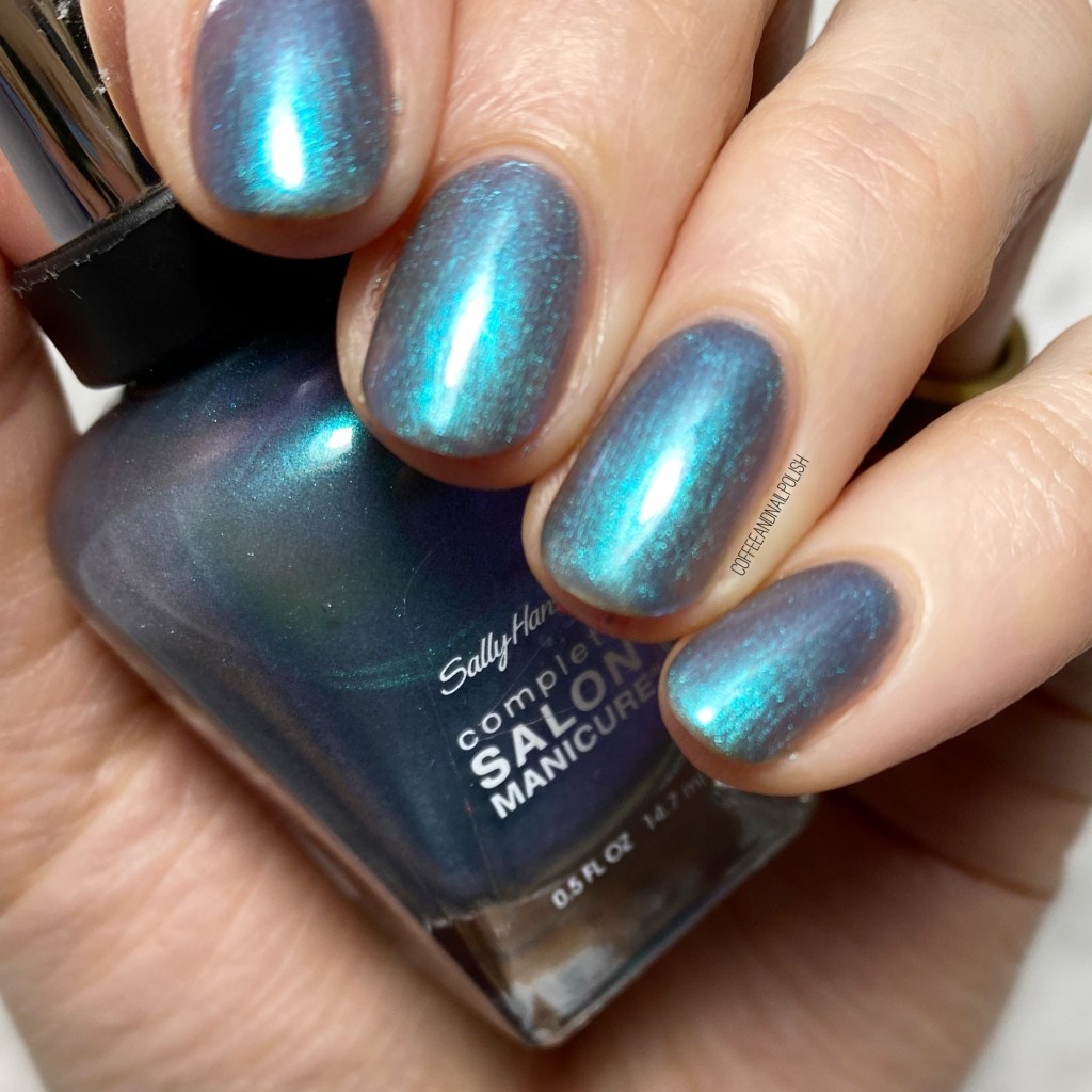
Today’s Swatch Sunday pick is China Glaze Boho Blues. This shade was originally released circa Spring 2015 as part of the Road Trip Collection, but I do believe it’s now part of the permanent collection as it’s currently listed for Sally on the Sally Beauty website & a few other websites where you can purchase China Glaze polishes.


2 coats + Essie Good to Go
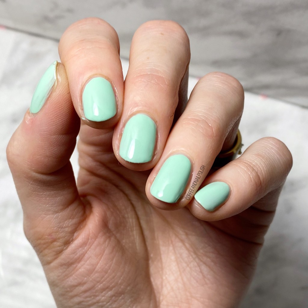
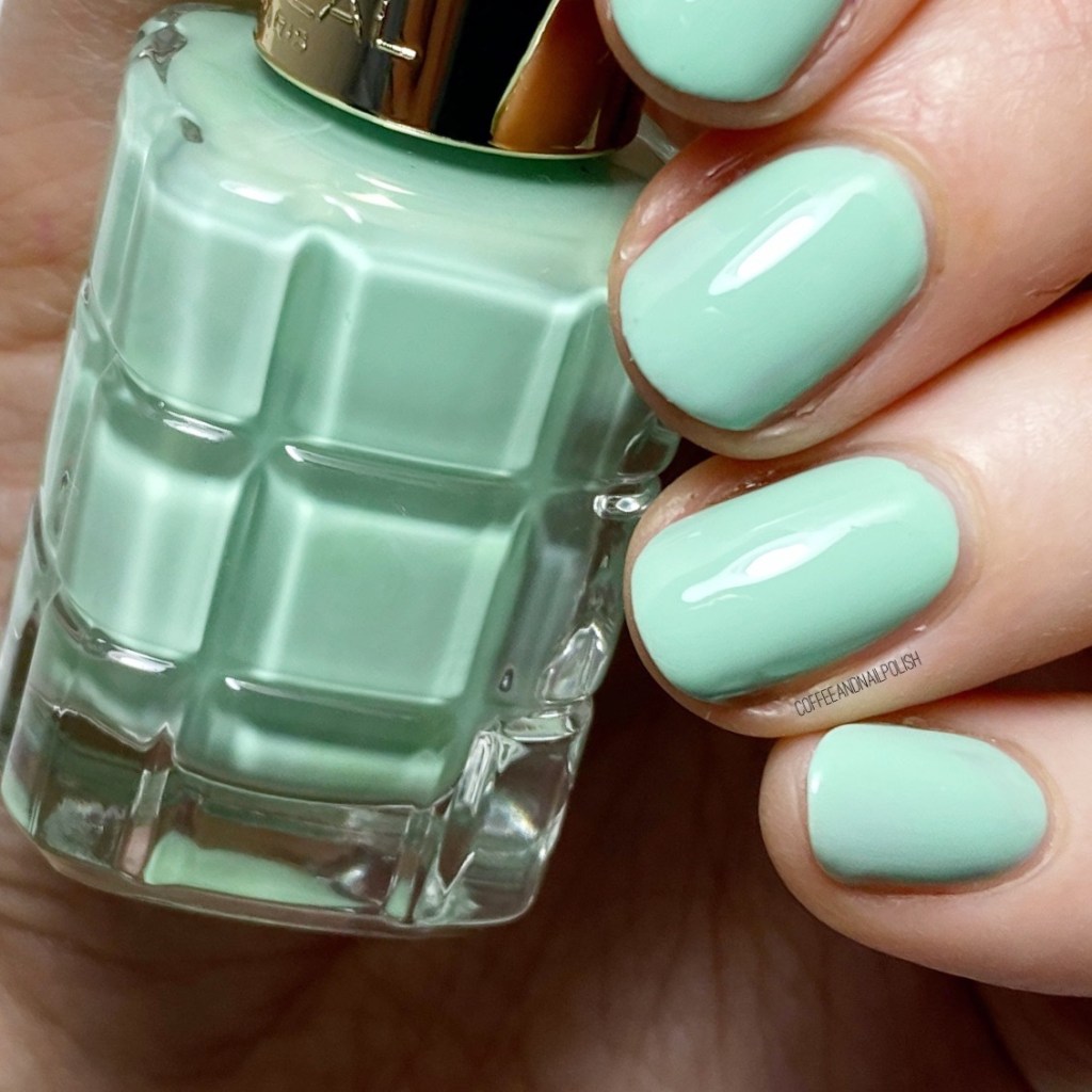
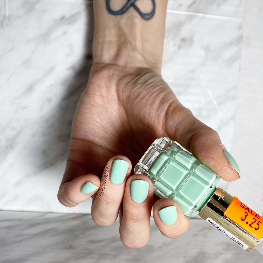
The cream formula is really easy to work with, & I managed 2 coats for full coverage. It does dry fairly gloss on its own, althouh didn’t completely level out — but that could be because this is an older bottle. I did apply top coat to kind of smooth things out a bit (& also because I was planning on some nail art).


As you can see, this is just such a smooth, beautiful, vibrant blue. It is definitely a perfect colour for Spring. I’ve always had an affinity for this shade of blue, or so says my nail polish collection, so they tend to be the first ones I’m drawn to in a nail polish collection.

What do you think about this beautiful shade? Do you have Boho Blues in your nail polish stash? Let me know in the comments below!