SWATCH SUNDAY — OPI Peace, Love & OPI

Hello lovelies & happy Sunday. & happy Thanksgiving to my fellow Canadians. I hope you all get a chance to celebrate however you prefer — whether that is turkey, Tofurky or pizza!

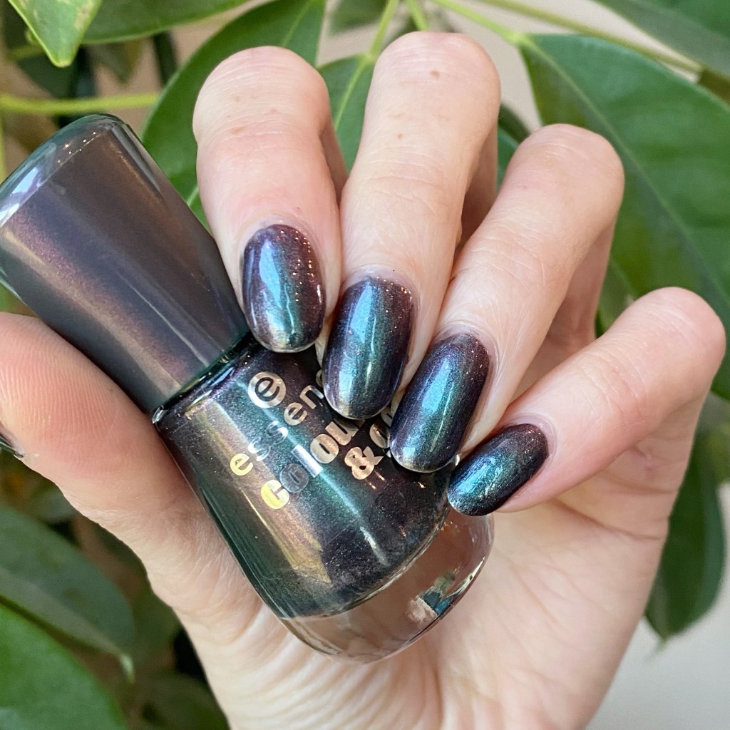
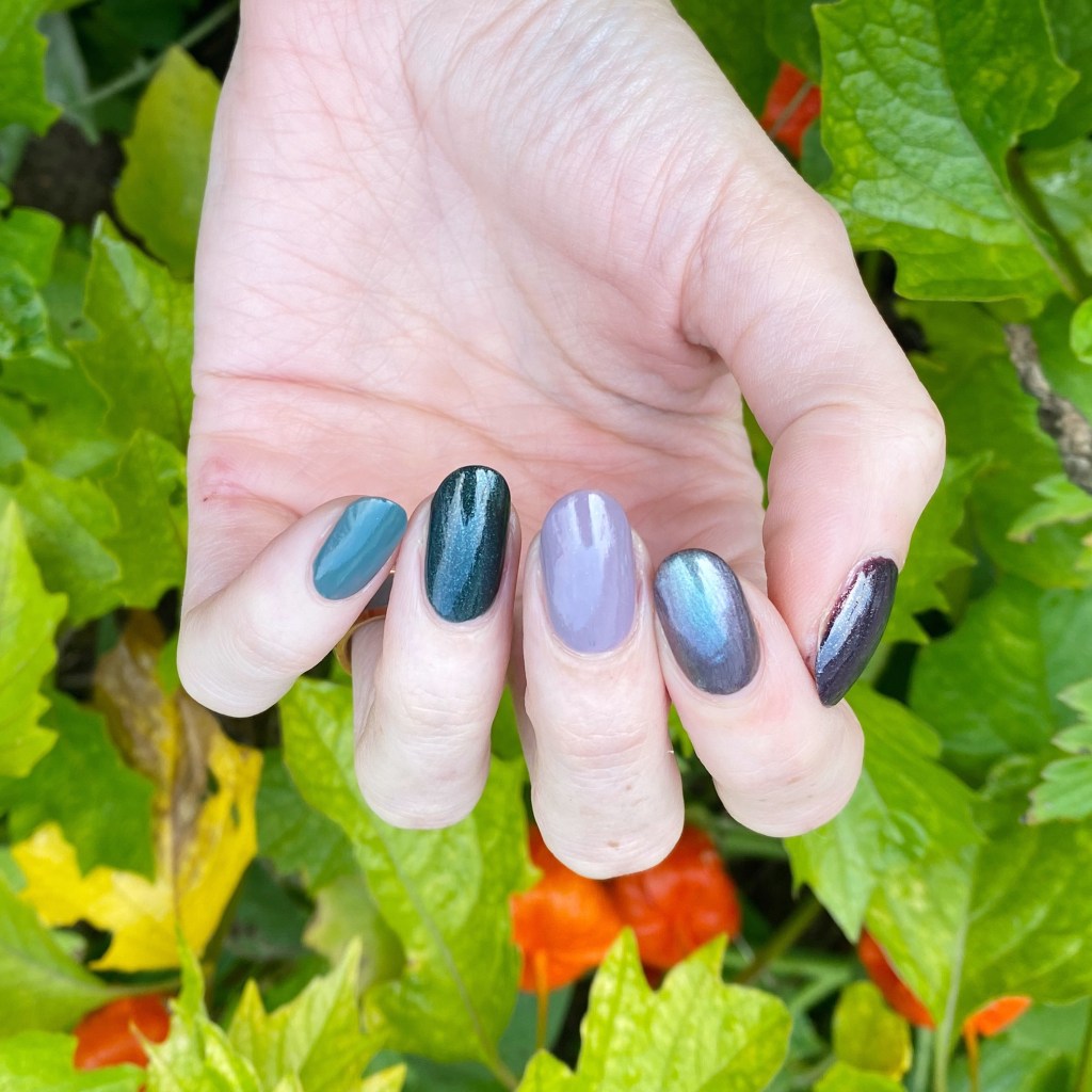
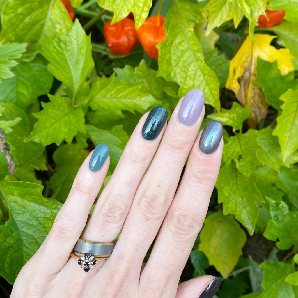
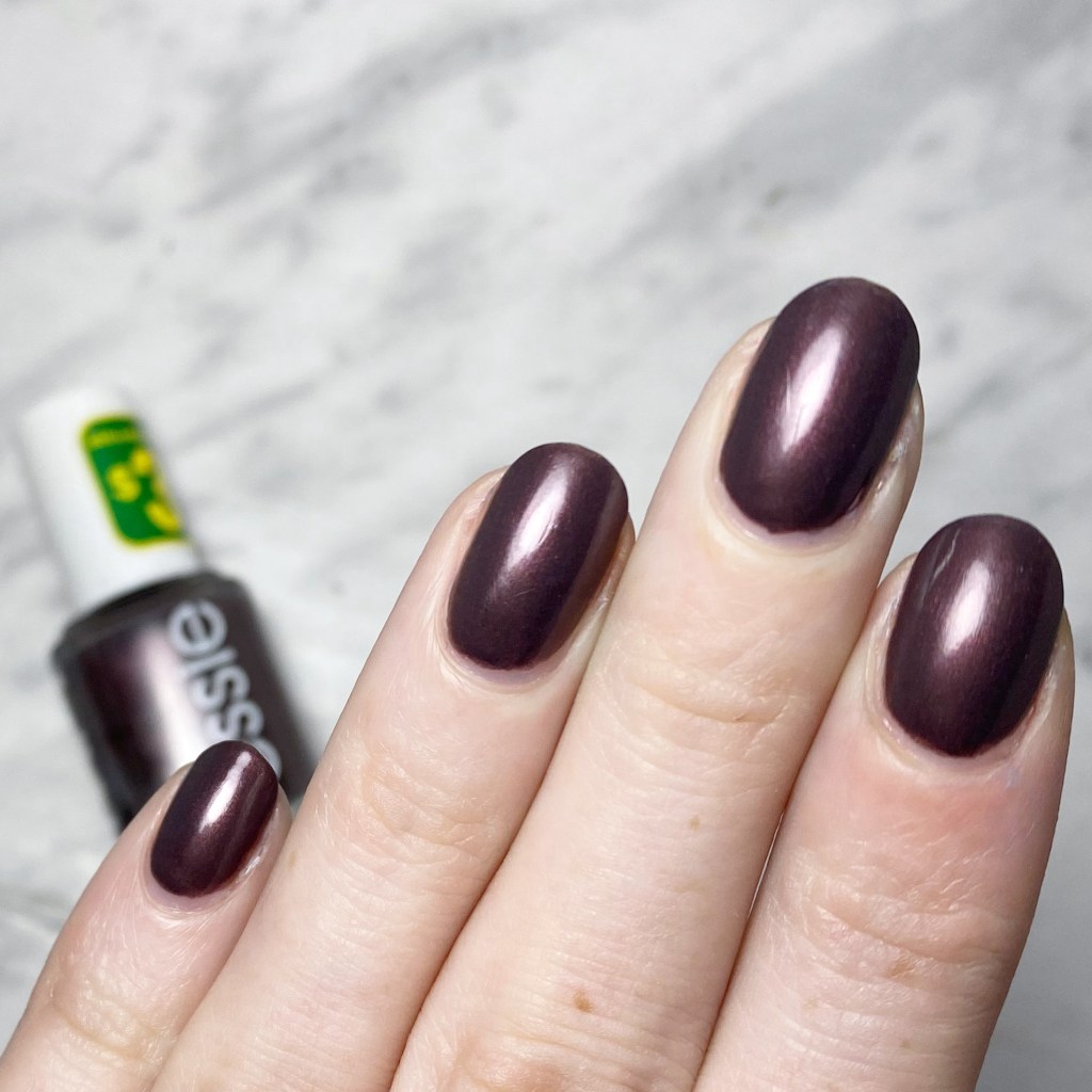
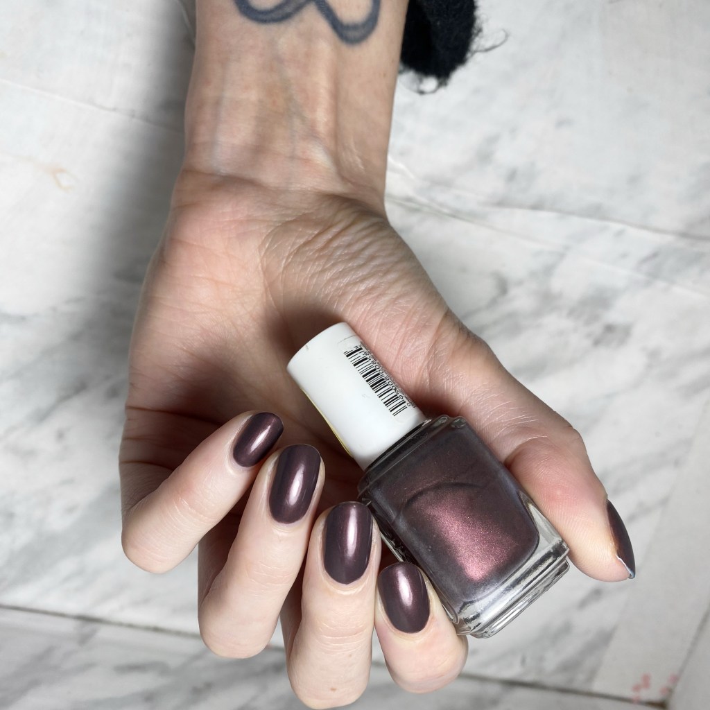
Today, though, it’s all about Swatch Sunday, & I’m sharing a fun old school shade from OPI dating back to OPI Fall/Winter San Fransisco collection from 2013. This is OPI Peace Love & OPI, a beautiful charcoal grey metallic with a fun teal purple duo chrome effect.

2 coats + Sally Hansen Complete Salon Manicure

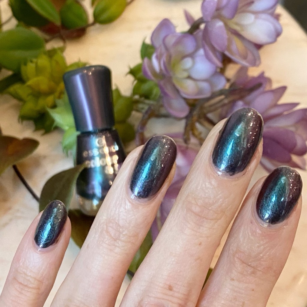
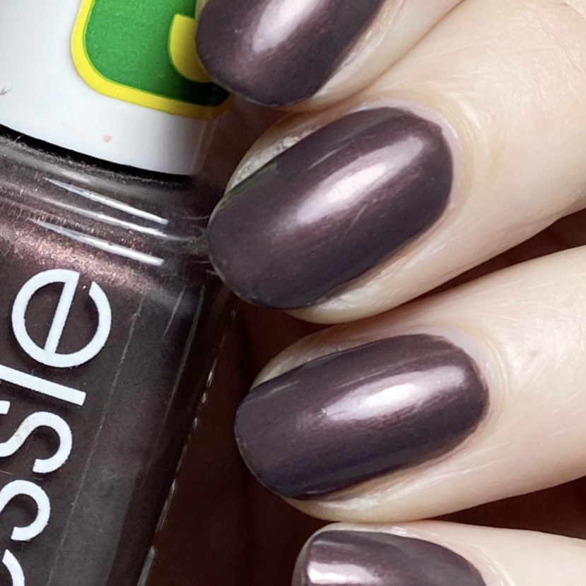
The formula on this beauty isn’t too hard, though it does have a bit of streakiness to it, which I found is alleviated with some top coat. The colour is beautiful — it reminds me a lot of Essie For The Twill of It which is another silver/grey favourite I used to wear quite a bit. & I do love a good duo/multi chrome effect, although I found it didn’t quite show up as much in my photos as it does in person.

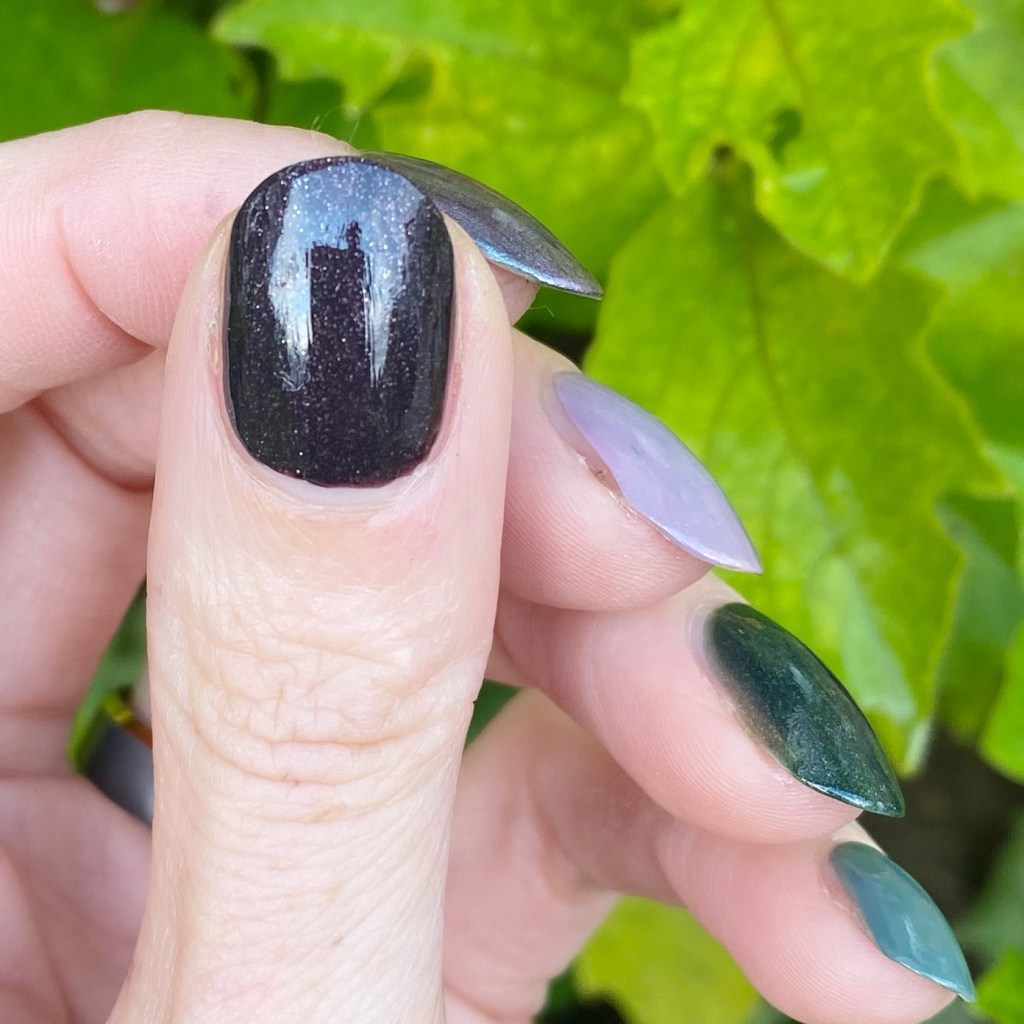
A little macro shot action. You can really see the teal & purple here.

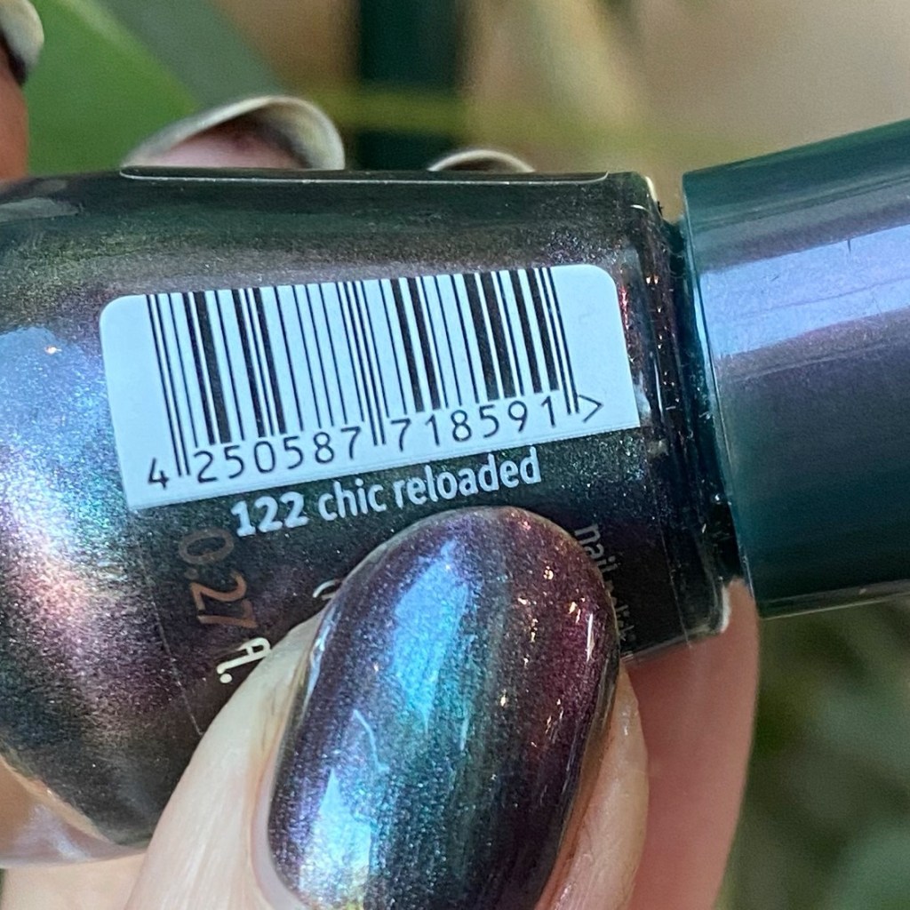
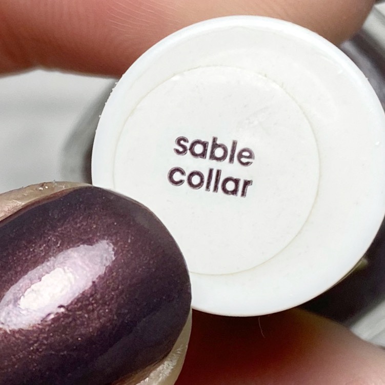
This shade has been in my stash a long, long time. I think, at least 6 years — it has a white spot on its lid, which says to me I bought it on clearance at Chatters. When I worked close to one, I used to love checking out the clearance section because they always had the most amazing deals on polishes!

What do you think about this shade from OPI? Do you have Peace Love & OPI in your own stash? Let me know what your favourite metallic grey polish is down in the comments below.

Have a lovely Sunday.

Dainty Grey Dotticure Accent Nails

Hello lovelies & happy Thursday!

I hope everyone’s week is going swimmingly so far. It’s almost the weekend! Today I’m showing off a pretty, easy & dainty nail art look that I wore recently.

As you might have noticed, I have been rocking short short short nails lately, thanks to a break on my middle finger nail, & I’ve been waiting (impatiently) for it to grow out. So it hasn’t left me super inspired when it comes to painting my nails, which I think has been showing. However, you know what always looks good? Polka Dots!

The polishes I used for this manicure are: 

  • Base Coat: Essie Hard To Resist Glow & Shine 
  • Top Coat: Essie Gel Setter
  • Essie Merino Cool
  • Essie Cocktail Bling
  • Essie Mosiac On Down
  • NailStuff.ca Dotting Tool Trio

What do you think of this colour combination on this dotticure look? I love grey on grey, & I thought it would be a perfect Fall transition look. Plus the little hints of gold are a nice touch.

Also I’m super happy with how my polka dots turned out — sometimes super dainty polka dots can be a struggle, but I think these look so perfect.

Over all, this reminds me of an old school Coffee & Nail Polish look, circa 2015/2016, & I’m not made about it. Plus, like I said, it fancies up my itty bit nails just a little bit more.

What do you think about this nail art look? Are you a fan of these teeny, tiny polka dots? Would you wear this look? Let me known down in the comments below!

Greyscale Quatrefoil

Good morning lovelies & happy February! It’s officially the month of love. 💗 But before I jump headfirst into all pink, all the time, I thought I would share a look a I created a week or so ago, when I was feeling the grey January blahs.

Today’s look started out as just a grey smooshy design, which was lovely, but looked like the perfect base from some tile inspired nails! So I pulled out one of my many stamping plates I don’t use nearly enough, & switched things up!

For this manicure, the polishes I used were:

  • Base Coat: Essie Strong Start
  • Top Coat: Sally Hansen Miracle Gel Top Coat
  • Sally Hansen Miracle Gel Get Mod
  • Sally Hansen Xtreme Wear Grey Area
  • Essence Rock My World!
  • Starrily Vantablack
  • NailStuff.ca Clear Stamper (COFFEE10 saves you 10%)
  • Born Pretty Store stamping plate BP-L003 (item #17921) — quatrafoil image (no longer available)

Seriously, how pretty is this greyscale look? I love how the base isn’t super in your face, & then the black really pops against it. Completely achieves the look I was trying to accomplish, & who wouldn’t want tile like this in their house? I know I certainly would! Plus it looks gorgeous posed against the greenery in my background (a plant shelf at work, right beside the window — the perfect nail art background!)

What do you think about this greyscale quatrefoil design? Would you wear something like this?

SWATCH SUNDAY — Chanel Le Vernis Nail Colour 513 Black Pearl

CC60B05C-BB61-43BC-980E-8C414480839D

537974BC-BB57-4895-9FD5-810321F9F6B8

Good morning lovelies & Happy Sunday! Today is a really exciting edition of Swatch Sunday because I’ve been sharing a polish from my Mom’s nail polish stash I’ve been dreaming of getting my hands on: Chanel Le Vernis Nail Colour 513 Black Pearl.

I looked this shade up online, & found posts about it all the way back to 2010. Sadly it looks like it has been discontinued, although I did see more than a few listings for it on EBay if you’re dying to get your hands on this shade.

8D1B0A0A-0B59-4E8F-8887-25FD850F496F

1A128C5F-4C04-4F70-B2E9-7A8FAEE4972F

For my swatches I did my base, 2 coats of colour, & finished off everything with top coat (Revlon Quick Dry Top Coat).

Black Pearl is a dark steel grey shimmer which has this very pretty dark teal shimmer that comes through in certain light. It’s very, very pretty & very perfect for this Fall weather. The formula was kind of thin on the first application, but the second coat definitely levels things out for perfect application. & even though this is the kind of polish that you think would be slightly streaky, I avoided too many brush strokes.

3AC9D2F8-4C0C-4E94-9424-B9CC249BD695

5E812144-7957-4E65-9593-BDF153D12C60

This is definitely the kind of shade I find myself drawn to as the days get cooler–darker shades that capture the Fall mood perfectly. & I’ll admit: I wish this beauty could come home with me, but I’m pretty sure if it disappears from my Mom’s stash, my bags would be the first ones searched. Haha.

A10EC62A-900A-437B-8403-1A3C5A48BD74

6B6C6FFD-FA92-408D-936D-BED4AA612D90

So what do we think about this shade? Are you loving dark moody colours are much as I am right now? Let me know down below! & let me know what your favourite Chanel shade is because I think I might need to add one to my own collection.

E780EEDB-B419-42FF-B350-571421A5563D

Deep Purple Leopard Print

6FE38B8C-2A38-424E-BEBB-DE881A84282D

C7E07B3D-380C-463E-9388-1555B0ED1626

Hello lovelies! Today I have some more nail art to share with you, this time outside the Glam Nails nail art challenge I’ve been participating in this month! It’s been absolute ages (a year!) since I last created a leopard print design, so it felt really, really overdue. & since I’ve been seriously drawn to Fall colours lately, I decided that colour scheme was what I needed right now.

304D0243-E1A4-4BDC-B027-D6607CB0CC4A

AA1B0BD9-CD3B-400A-BF78-9D371FB376B0

The polishes I used for this manicure were:

  • Base Coat: Sally Hansen Complete Salon Manicure Strengthening Base Coat
  • Base Coat: Quo by ORLY Bonder Base Coat
  • Top Coat: Essie Gel Setter
  • Quo by ORLY Staycation
  • Essence Plump Power
  • Sally Hansen I ❤️ Nail Art Pen in Black
  • NailStuff.ca dotting tool

397B892D-2AD6-4B1F-B1B3-CBC2AFEC332C

490AB959-7DE6-4CF6-B23C-73B805A7362B

So painting my nails right now is still a bit of a struggle right now. Mostly, I’ve been trying to paint my nails when both the babes sleep, either during nap time during the day, or at night after bedtime. Sometimes it works out for me, & sometimes it takes me two days to create a design. For this particular design, I wanted to do something less complicated but still fancy. My secret weapon for a quick leopard print nail art is always my Sally Hansen I ❤️ Nail Art Pen in Black as it seriously cuts down on time when drawing the outline of my leopard.

C89AC19E-7A8F-4845-B93B-E2E28BB76590

Someday I’ll attempt a classic leopard print colour scheme, but today is not that day. It’s just way more fun playing around with unusual colour schemes. Plus I really love the dark purple on the grey-ish base. I feel like this colour combination is going to be used a lot as Autumn creeps closer–it would look so good together in a dotticure or as a chevron moon design!

A22F8E35-C5C5-402E-9F9E-5F84C362BA47

5EE3F624-FFEB-4831-BDFC-5D7FC81EFDA8

What do you think about this leopard print design? Would you rock this design? Let me know all your thoughts down in the comments below!