SWATCH SUNDAY: Finger PaintsĀ 

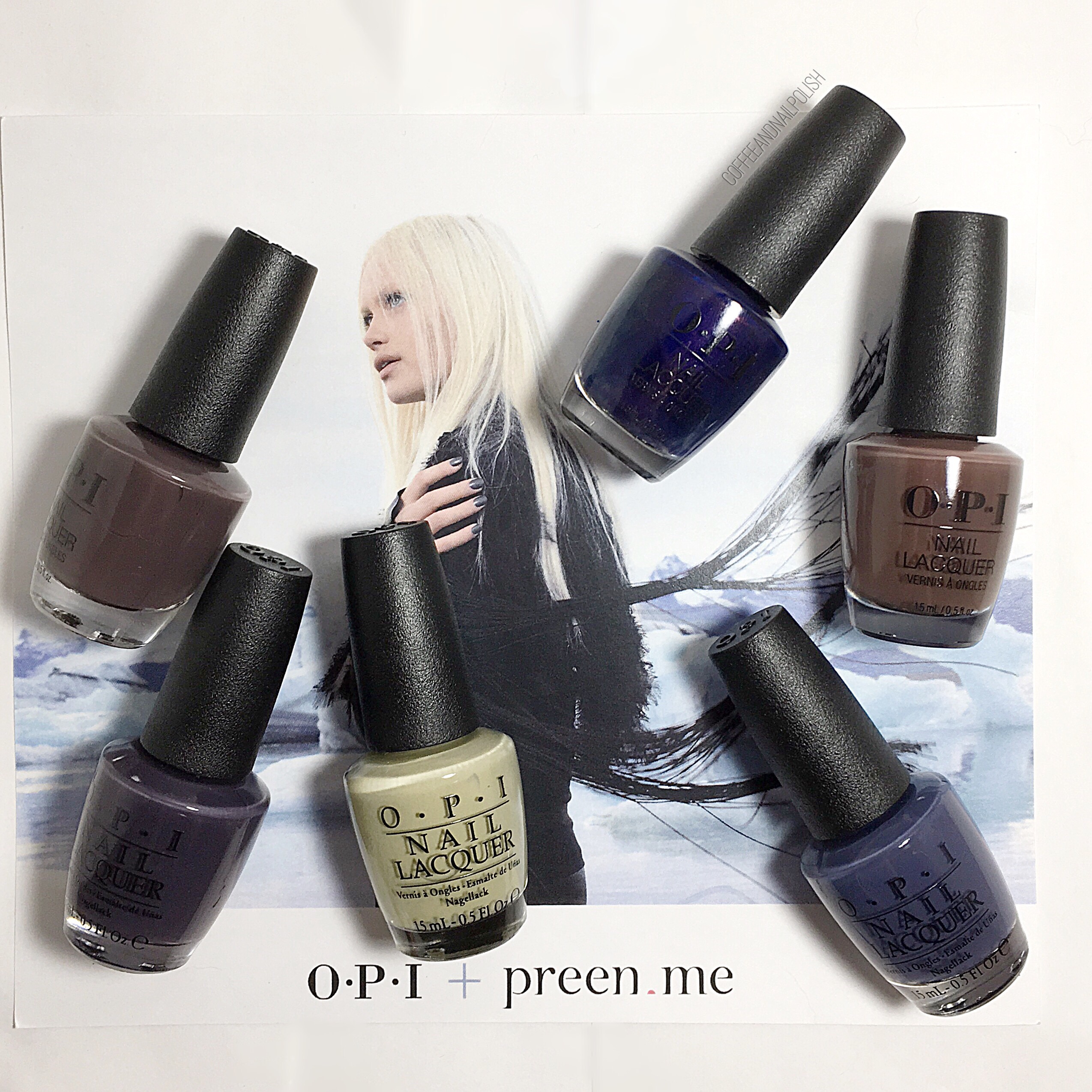
Happy Swatch Sunday lovelies! I was recently in my local Sally’s beauty & noticed they were having a Buy 2 Get 1 Sale on their Finger Paints polishes. I was late to discovering the Finger Paints love, but once I did I fell in love. So when I came across a deal like that, I knew I had to get a couple colours to add to my stash (even though I totally don’t need more nail polish). So I thought I would Swatch my new shades immediately, so they don’t sit in the back of my stash untried for the next year. 
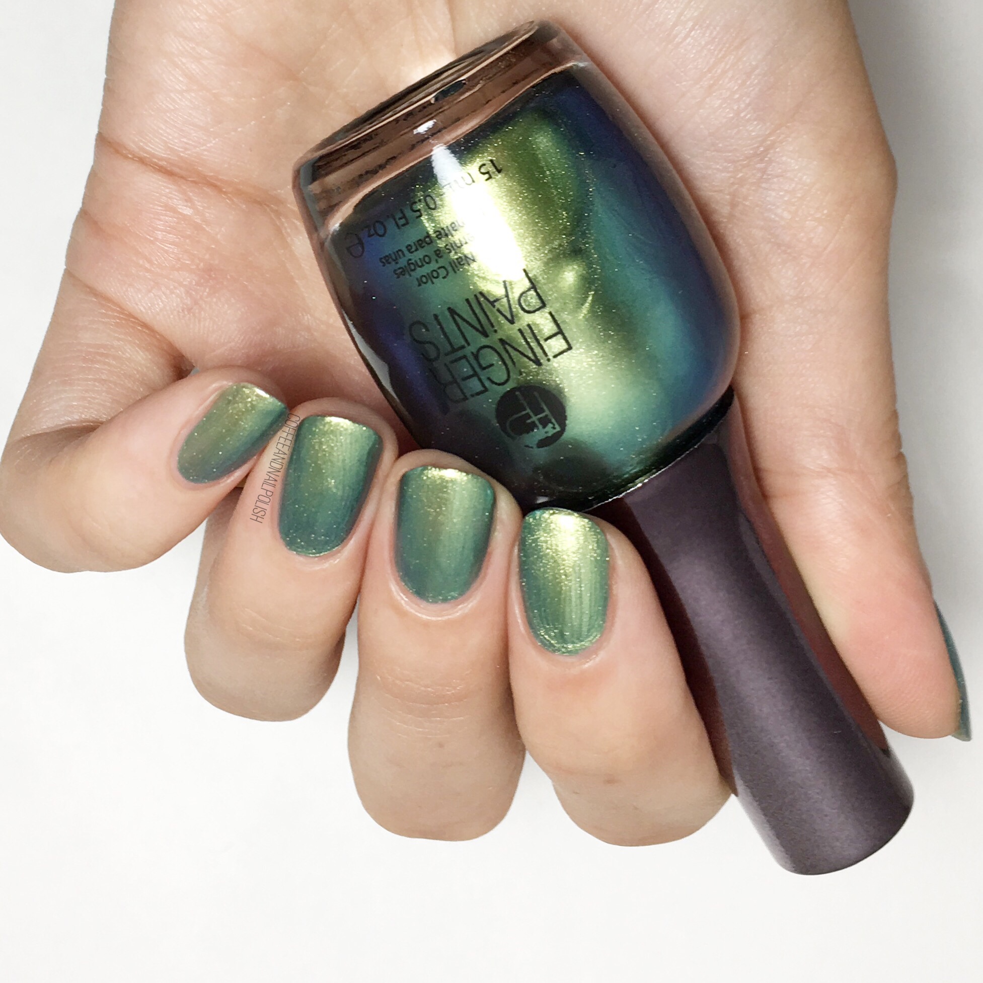
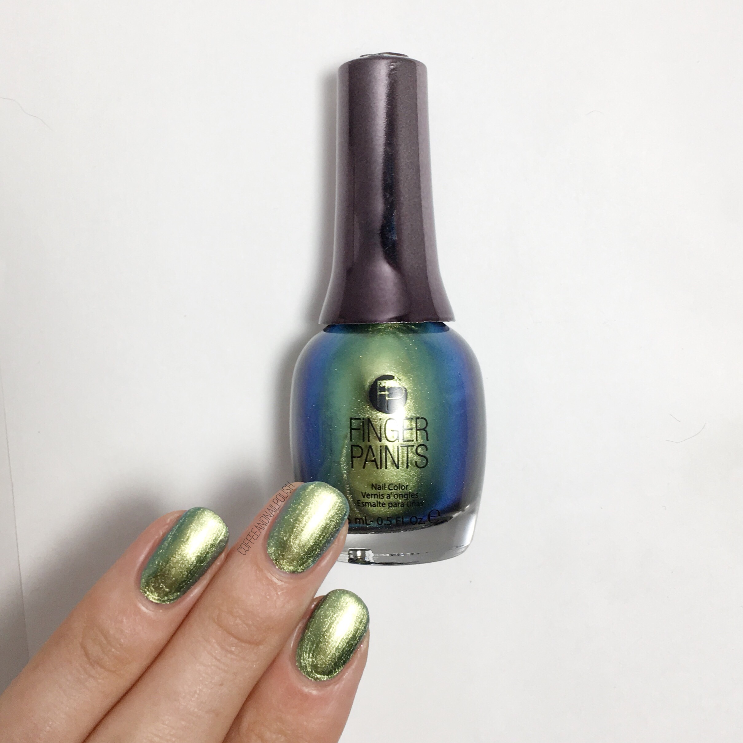
Dimensional Design

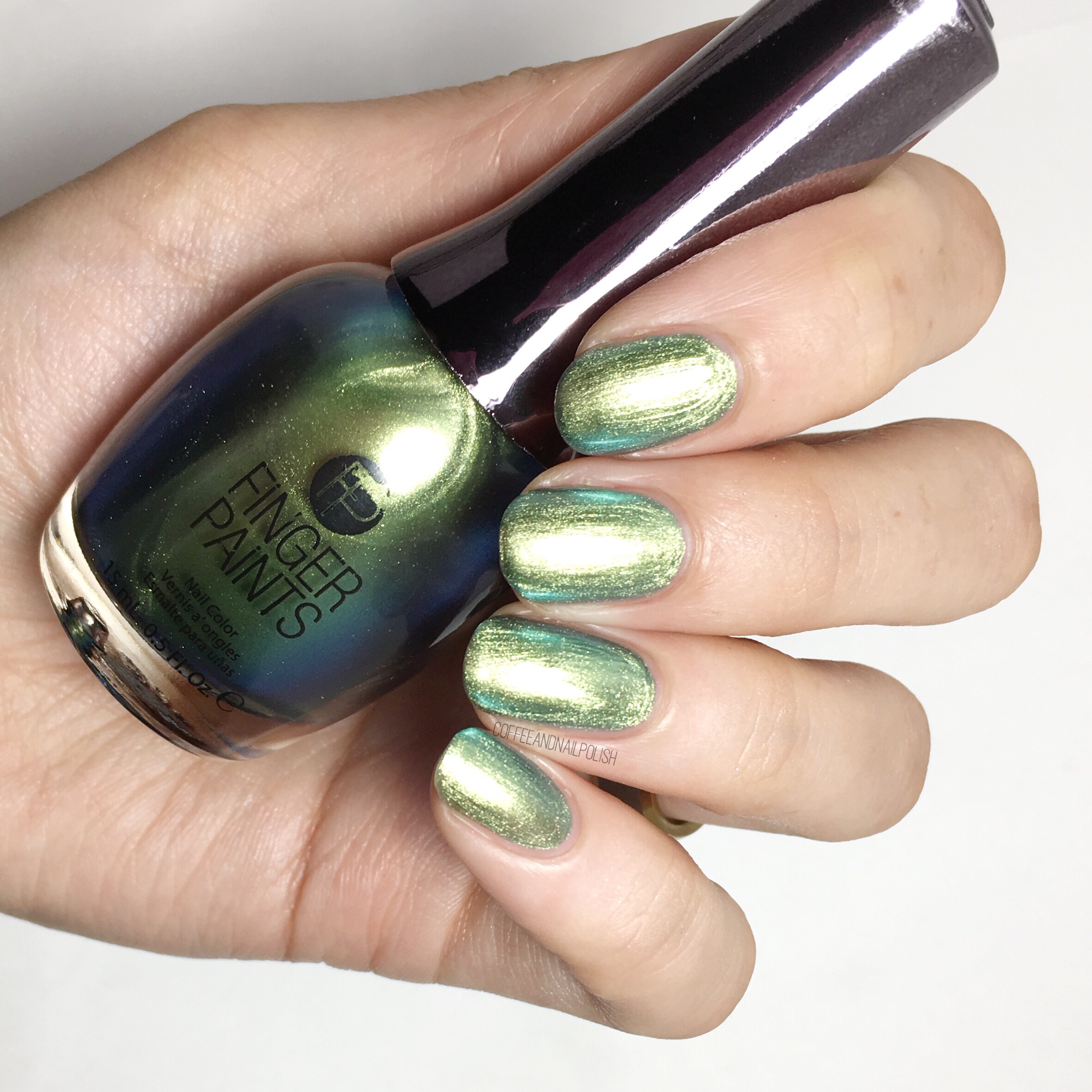
Dimensional Design is from the Summer  Chromaticity collection. In the bottle it comes across as a green-ish chrome shade that shifts to a peacock blue in the bottle. For my swatch, I used two coats. Sadly, I couldn’t escape the streaks on application which kind of took away from the chrome like finish. The shift is also much less on the nail than in the bottle which was a bit sad. But overall, Dimensional Design is still a very pretty polish. 
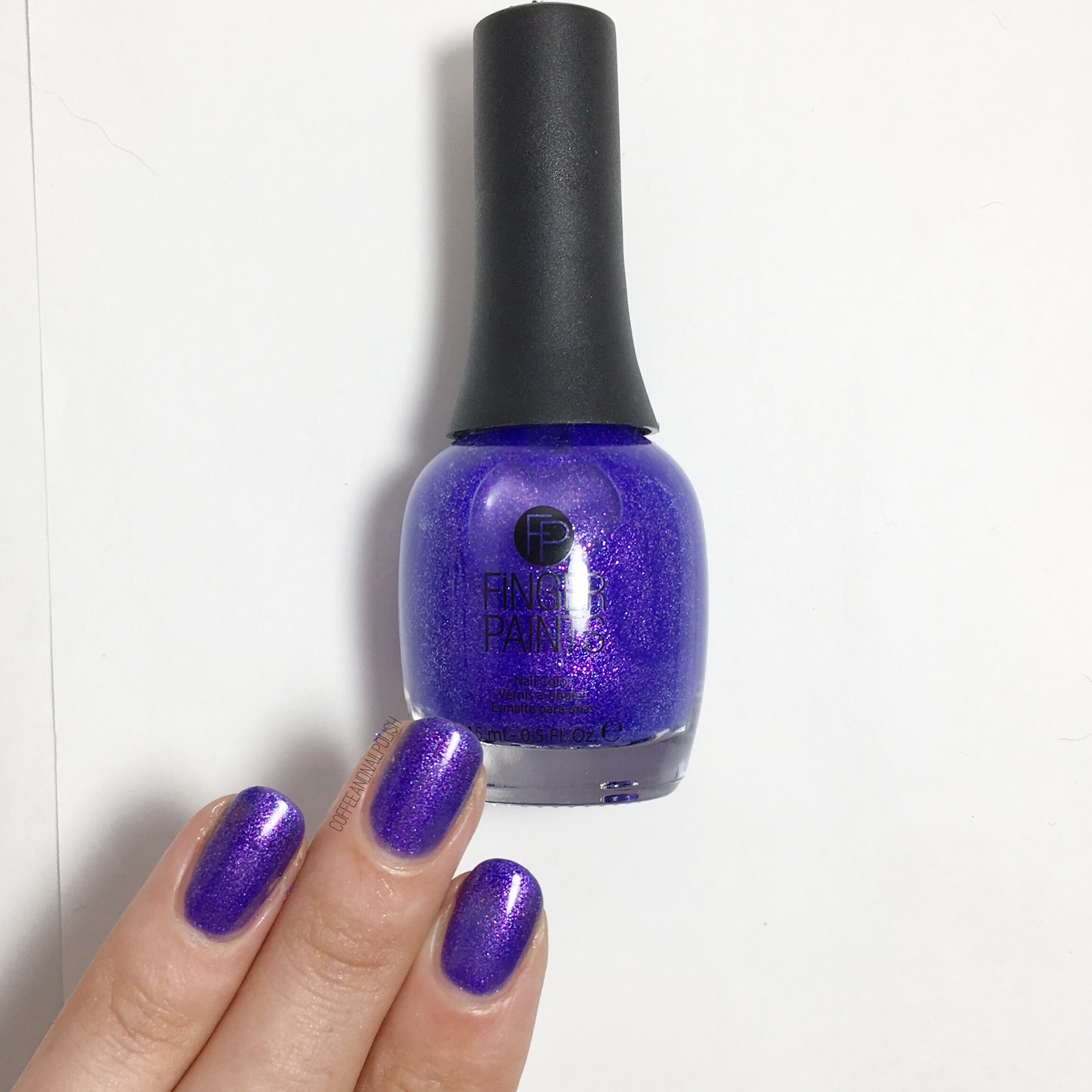
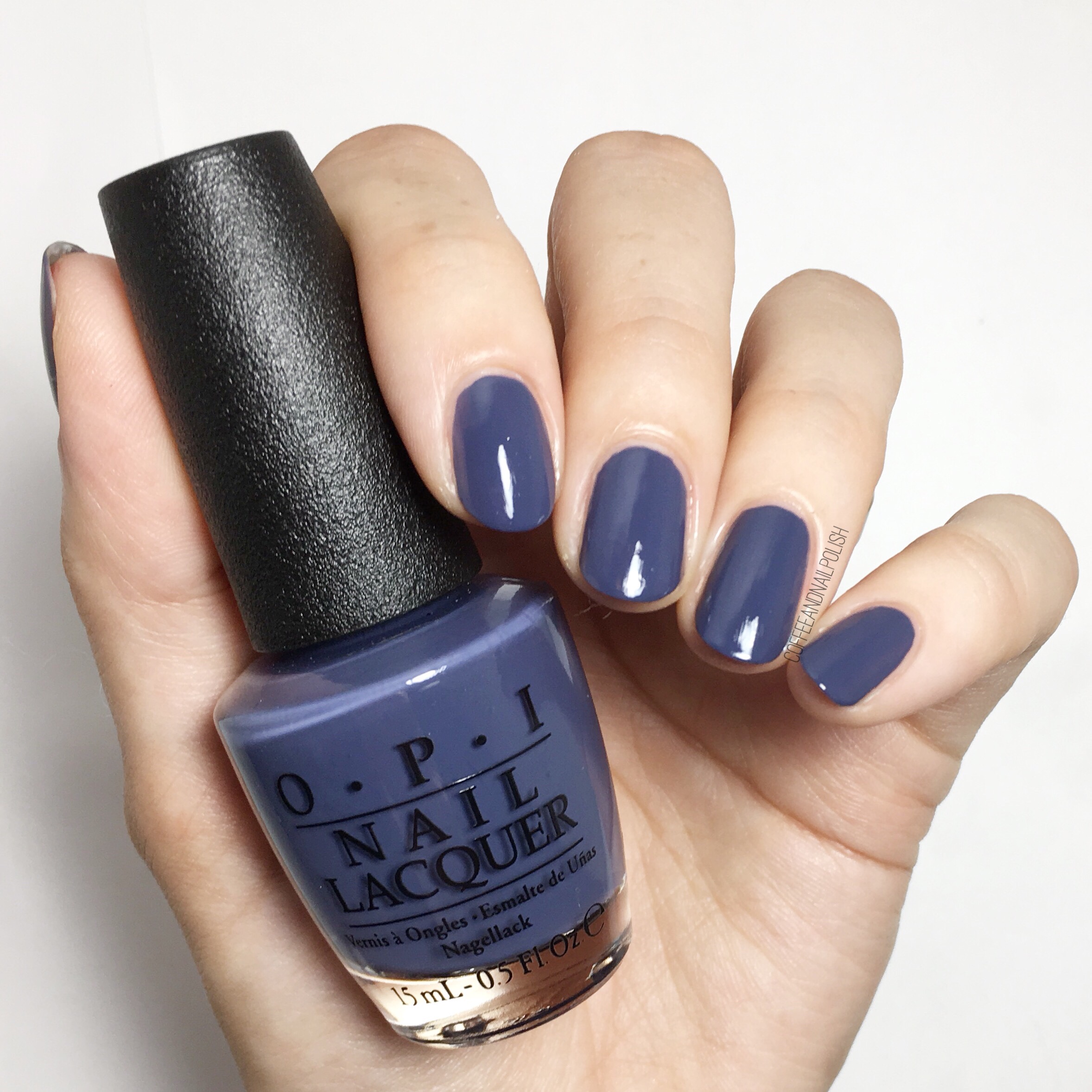
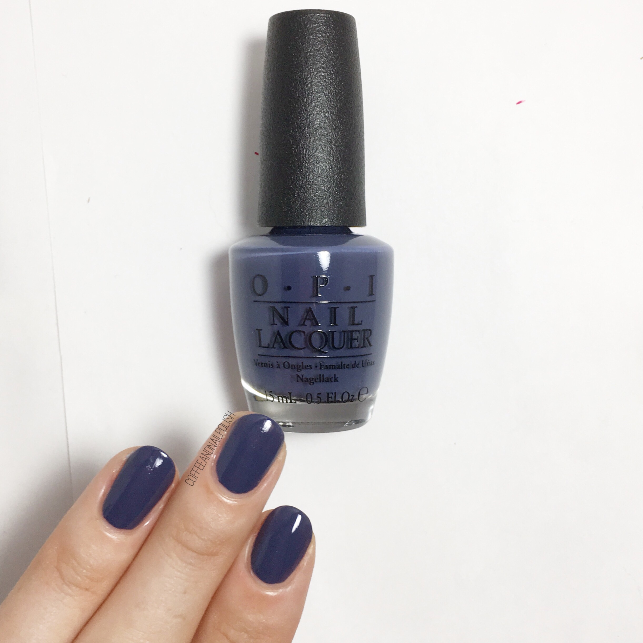
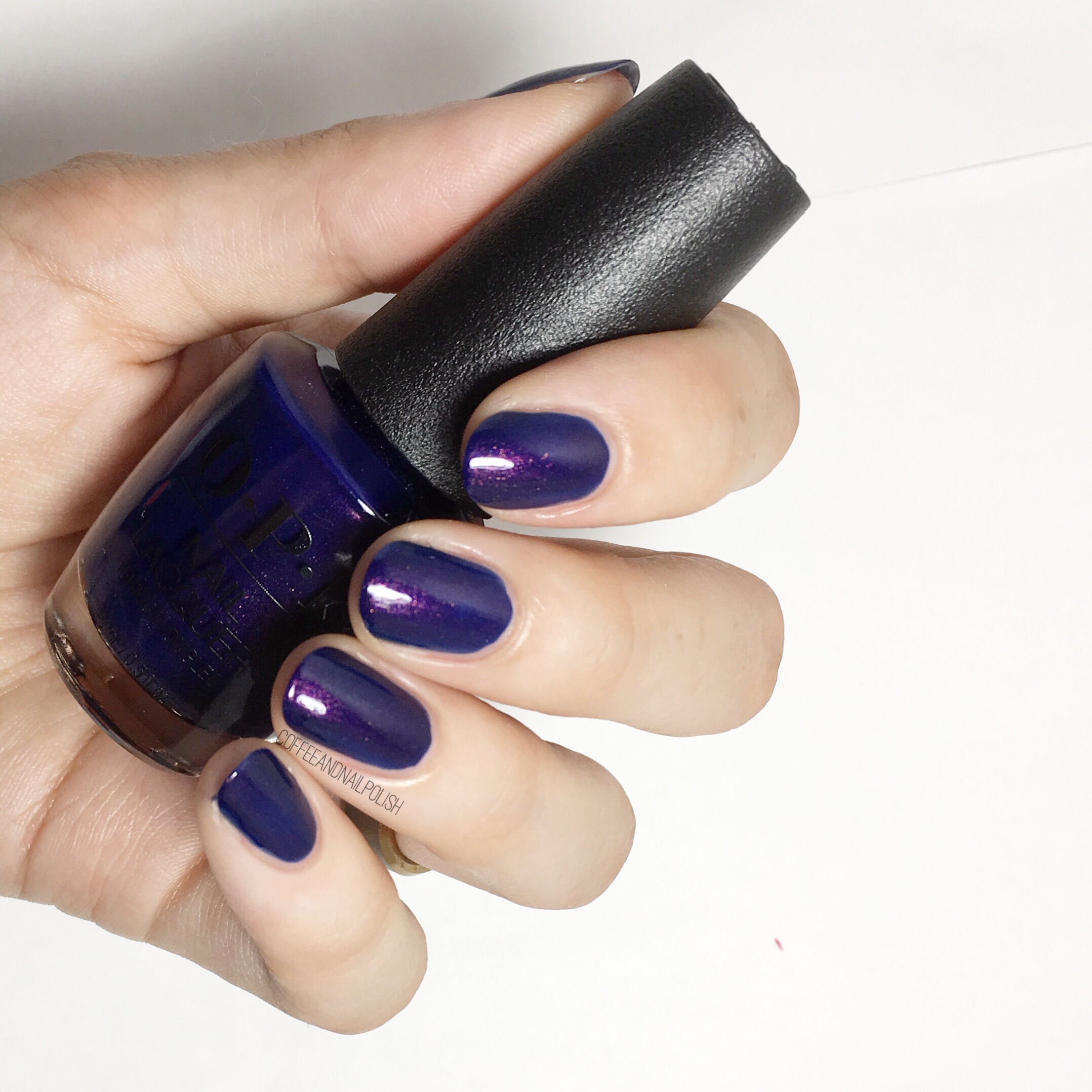
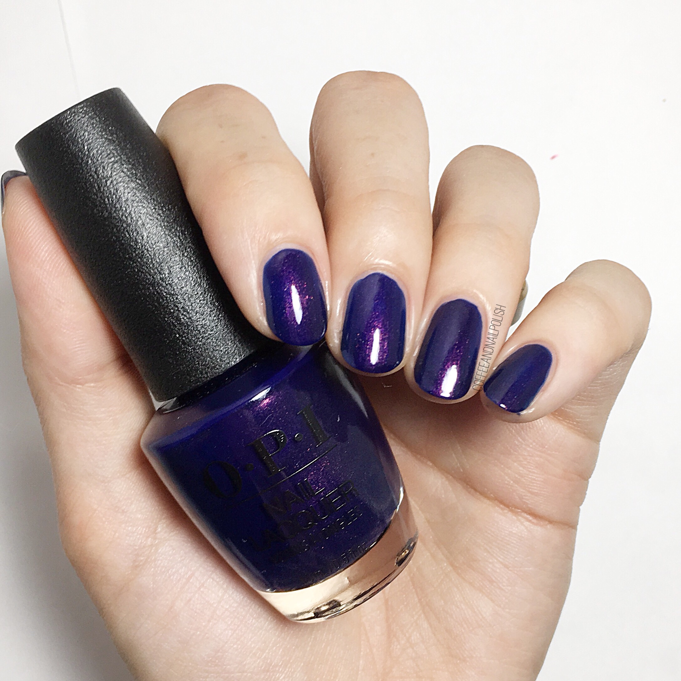
Hues Blue

Hues Blue is part of the Finger Paints core line & this was the last bottle left at my local store & I totally understand why! This gorgeous blurple shade is packed full of pink & blue micro glitters & took two coats to build opacity (although you can see a hint of nail line), but you could also use it as a topper over some undies. & oh my is it pretty–I just can’t even deal with how pretty this shade is! It reminds me a lot of Finger Paints Gorgeous Graffiti which is another favourite from this brand. 

Piece De Resistance

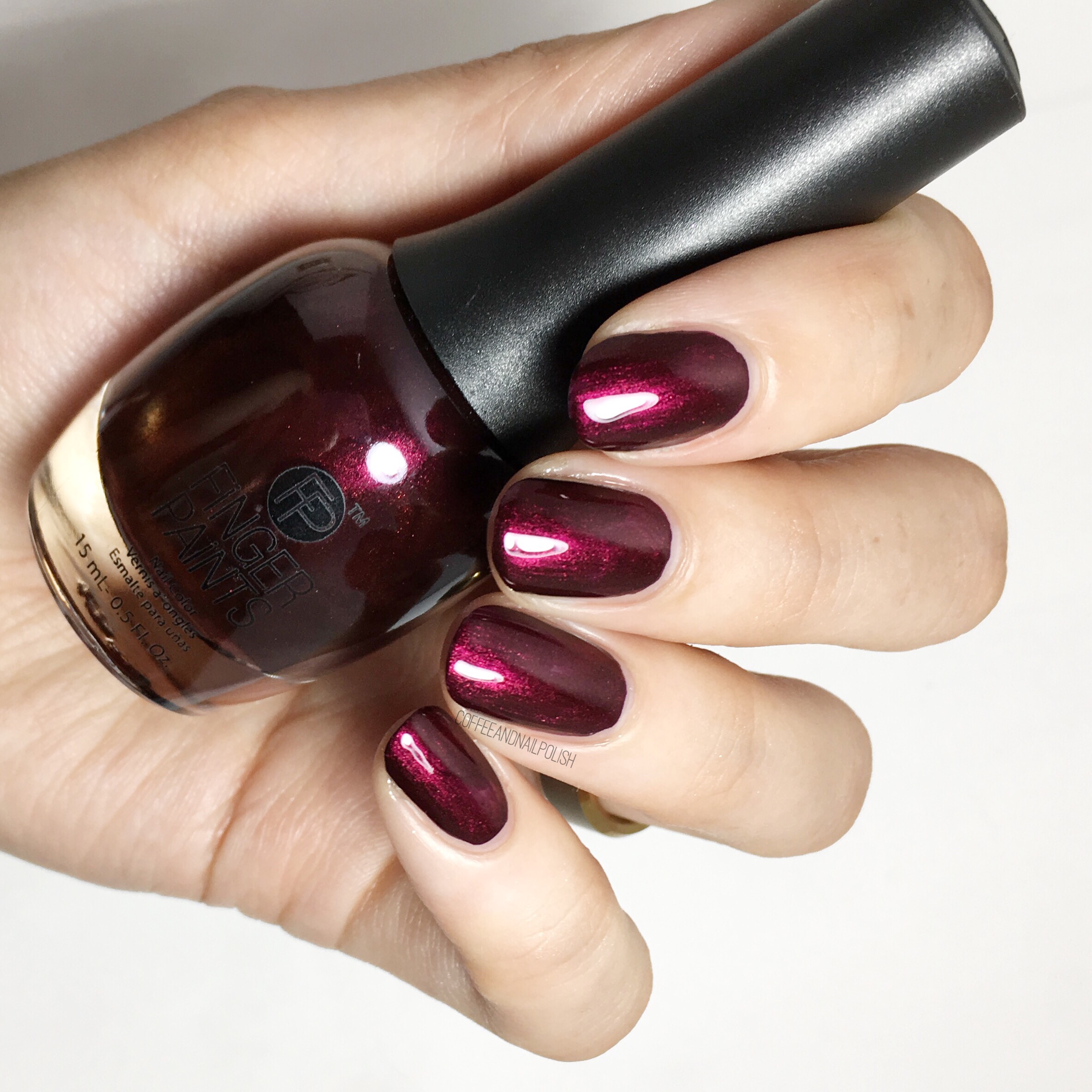
Can we just talk about this deep red shimmer, also part of the core Finger Paints collection? It’s pretty isn’t it? You know how much I ā™„ļø a good red polish, & even better it only took ONE COAT for these swatches. One coat. I don’t think I own another red polish that takes only one coat & it makes me squeal. The polish has an awesome shine to it which really shows off the lighter shimmer. Such a perfect Fall shade. šŸšŸ‚


& that’s it for today! Which of the three shades is your favourite? Let me know your thoughts (or your personal favourite Finger Paints shade!) in the comments below. 

OPI Fall/Winter 2017 Iceland Collection Part 2


Okay so I somehow managed to get the second half of the OPI Fall/Winter collection swatched (even with a baby who has decided he doesn’t like bedtime) so if anyone feels like bring me cupcakes or a really large coffee you are more than welcome to! & for you I have 6 more shades to share from this gorgeous collection, dipping into the darker & richer shades from this trip to Iceland OPI is sending us on. 

All of these lovely polishes were all gifted to me by OPI as part of the #PreenMeVIP program, as well as OPI’s natural base coat & top coat which I used for all swatches! 

Less is Norse

I like this shade, I like it a lot! OPI named this the Hero Shade of the collection, & I get it! Two coats for opacity (although it could potentially be a one coater if you’re really careful) & it goes on really smooth. The formula is just great which I like in a navy blue. & the underlying dust dusty-ness of the shade makes it just a little bit different than other Navy shades I own. 


Turn On The Northern Lights

If you’re looking to buy one shade from this OPI collection, personally I think this is the shade you need. It’s beautiful. Two coats gives you this shimmery indigo that just glows on the nail. You get that hint of fire-y red/pink/gold shimmer coming through & it makes me so excited. & the fact the shimmer shows up just as well on the nail on the bottle gives it even more points. The only thing I didn’t love was it’s weird smell–it smelled kind of skunky going on–but for this gorgeous colour I’m okay with that! 


This Isn’t Greenland

The first thing that came to mind when I saw this shade was “interesting” because as you know, I’m not much of a green polish kind of girl. But once I put it on, I really kind of liked it. This is two coats of this pistachio shade & I really needed three because I’ve got some streaks happening. I could definitely see this myself wearing this for a nice fresh punch of colour when I’m not in the mood for my usual blues or purples. & I think it would make an awesome base for some Fall leaves nail art! 


That’s What Friends Are Thor

I don’t have many brown shades in my massive stash, but brown in a Fall/Winter collection makes a lot of sense. & this chocolate-y brown is actually quite pretty. The Formula was great, only 2 coats, & dried down quite nice. It dries down slightly darker than in the bottle, but not in a way that changes the colour too much. 


Krona-logical Order

Yep, another brown! This shade however is much more dusty with grey undertones. This was two much needed coats (coat one was extremely streaky). Its a nice shade, although not really my usual go to, but I could definitely see myself grabbing it if I was needing something a little more dark & vampy on my nails. It works really well for this collection. 


Suzi & The Arctic Fox

& last but not least in the collection we have a surprise favourite shade for me! This dark grey, with blurple understones, took two coats for full opacity. It looks quite dark & grey but once you put it on & look at it under lighter circumstances you see that blurple coming through. It’s reminds me of a darker version of OPI Miss You-niverse which is one of my all time favourite OPI shades! Love love love it! 


& that’s it! What do you think of OPI’s Fall/Winter 2017 collection? Are there any shades which stood out to you from the collection you just have to have? For me I know I’ll be wearing Aurora Berry-alis, Turn On The Northern Lights & Suzy & the Artic Fox a lot this coming season! Let me know all your thoughts on this collection down below. 

SWATCH SUNDAY: OPI Fall/Winter 2017 Iceland Collection Swatches Part 1!

Good Morning lovelies. It’s my favourite day of the week (& not just because the Mr takes Little Bubs to watch cartoons so I can sleep in!)… it’s Swatch Sunday. & it’s so exciting that I actually had to break it up into two days because I have the entire OPI Fall/Winter 2017 Iceland Collection to share with you. I’ve been obsessing about Fall shades for a few weeks now, so it makes me so excited to get to show off some finally! 

All of these lovely polishes were all gifted to me by OPI as part of the #PreenMeVIP program, as well as OPI’s natural base coat & top coat which I used for all swatches! 

 Icelanded a Bottle of OPI

Okay I’ll be the first to admit this kind of shade is not my usual go to polish grab, but once I put it on I really liked it. & as far as a Fall shade, this taupe-y brown is perfect. This was two coats, & the formula dried down really nice. If someone was looking for a great neutral shade that was office appropriate but not a simple nude, this would be a great choice for them! 


I’ll Have a Gin & Tectonic

Oooooh this pink leaning peach shade is very pretty. & it definitely brings out the yellow/olive undertones in my skin. It took 2 coats to opacity & top coat is a necessity to avoid any streakiness. It’s a gorgeous shade, although I do think more Spring than Fall when I see it. Paired with one of the darker shades in the collection in a half moon or chevron moon & I bet it would look lovely & more Fall appropriate!


Reykjavik Has All The Hot Spots


Hello frosty pink rose gold perfection. Whatever you want to call this shade, it’s very pretty! It’s also 3 coats which I’m okay with because of the end result. There are some streaks but I feel like that’s part formula & part my lack of carefulness. This one definitely feels very Fall to me & even though it’s been forever since frosted polish was part of my collection, I can definitely see myself featuring this shade a lot this season! 


Aurora Berry-alis

You know sometimes when you see people posting swatches of a shade & you think it’s so pretty but figure it can’t possibly look that beautiful in real life? Well this berry shade is actually as gorgeous as it looks. It’s slightly dusty but rich at the same time. I used 2 coats for my swatches below. It’s juicy & the formula is flawless & I never wanted to take it off. Expect to see me wearing this shade a lot this Fall! (Definitely going to need a back up bottle!)


Check Out The Old Geysirs

Now this shade screams Iceland! For my swatch, I needed 2 coats of this greyed blue for full opacity. I was quite impressed the shimmer showed up on the nail as well as it showed in the bottle. It gave a little extra pop on the nail! You know how much I love a good blue shade, & this shade was very very pretty. Reminds me of icicles! 


 One Heckla of a Color!

& finally for today’s swatches we have this 2 coated purple creamthat as you can see dries slightly darker than the bottle colour. OPI describes this shade as a “frosty purple” on their site which I would necessarily agree with the frosty part, but it does have that little bit of underlying dusty-ness to it that a lot of these shades have that works really well to bring the whole collection together. 

& that’s it for today? What do you think of the OPI Fall/Winter collection? Any favourites you see already that you have to have? Let me know your thoughts in the comments below! 

I hope to have part 2 of the collection (the much darker shades!) up either tomorrow or Tuesday! 

SWATCH SUNDAY: Wrenn Polish!Ā 

Good Morning & happy Sunday! Today I’ve got a really exciting swatch Sunday post for you featuring three very gorgeous shades from Wrenn Polish. You have no idea how excited I was when my package from Alissa showed up on my door step, & I couldn’t wait to swatch these gorgeous shades to show off to you! 

A little preemptive warning–this post is going to be long & full of pictures of these stunning polishes. 

Wrenn Polish is a subset of Shop Wrenn which encompasses both these beautiful 5-free vegan & cruelty free nail polishes & their hand made Druzy stone jewelry which inspires it. I was lucky enough to receive three shades for review: Passionfruit Pink, Peri*twinkle* & A Pirates Life


Passionfruit Pink

Passionfruit Pink is a dusty dark blush shade that is infused with the most vivid gold shimmer. For my swatch, I had perfect opacity in 2 coats. As soon as I painted Passionfruit Pink on my nails, I knew this was going to be a go to shade for Fall. The pink on its own is a lovely, girlie shade but with the gold shimmer it becomes so much more. & unlike a lot of other nail polishes, this shimmer does not hide on the nail. As you can see from my pictures, it’s in your face & just as present on the nail as it is in the bottle! You can easily understand how these are inspired by Shop Wrenn’s beautiful stone jewelry. 

Peri*twinkle*

Peri*twinkle* is a blurple beauty that took three thin coats for full opacity. The formula on this shade was a little bit thinner than the other two, which was the reason for the extra coat, but I feel like if you were just looking for a sheer polish to add a little shimmer to your nails, one coat would be perfect for you. Depending on the angle, you can get flashes of pink, purple or blue & it’s so distractingly beautiful. I also would be very curious to see what it would do layered over some dark undies! The flash of different colours just makes this shade so beautiful & unique. I thought it might be similar to Quo by ORLY Sweet Dream, but Peri*twinkle* has a much more vivid shift & is much more blurple. 

A Pirates Life

A Pirates Life, the final shade I received for review, is absolutely my favourite. That’s two coats for opacity & honestly they went on like a dream. The formula on all these polishes are incredibly smooth & easy to use & A Pirates Life is the most perfect of the three I tried. The flash of turquoise shimmer just makes it the perfect beach blue–you can’t help but think of Caribbean waters when you stare at it (which makes the name very fitting). You can easily see how these shades are inspired by the Caribbean Druzy stone. 


Now I couldn’t not pair all these shades together, so after failing at a gradient I decided my next best option was a colour block! & oh boy did it turn out pretty. I used Essie Sweet SoufflĆ© for my base (because of its own underlying shimmer) & the straight vinyls from Xroma Polish & Vinyls to mark off my blocking. 

All three Wrenn Polish shades went on easily & levelled well even before top coat. The shades are unique & it is so easy to see where they draw their inspiration from! If you’re interested in picking up these shades for yourself, you can buy them from the Shop Wrenn Website. & don’t forget to check out her gorgeous jewelry designs to compliment your nails! 

What do you trying of these Wrenn Polish colours? Which shade is your favourite? Let me know in the comments below! 

*PR SAMPLE* Some of these items were sent to me for review. However, all opinions are my own. 

SWATCH SUNDAY — Essie Sweet Soufflé 

I’ve mentioned previously that the whole reason I’m a nail polish addict today is the fact that I spent a good chunk of my preteen & early teenage years on the hunt for the perfect white nail polish ala a certain 90s vampire slayer. Even though my days of wear giant bubble rings & cutting my hair like Sarah Michelle Gellat circa 1997 are pretty much over, that doesn’t my I still don’t have an appreciation for a good white nail polish every so often. So when I saw Sweet SoufflĆ© from the Essie Summer 2017 collection–described by Essie as a creamy white with golden glow–it was pretty much assumed I was going to have to add it to my collection. 

To achieve opacity, this took 3 very careful coats for the polish to level & hide any streakiness. The shimmer definitely translates to the nail, even if you can’t see it in photos. & I love everything about it. This is the kind of white shade I used to dream about at 13, instead of the chalky whites that looked more like I was wearing white out on my nails! 

I really love the golden orange shimmer of Sweet SoufflĆ© & the more I starred at it, the more it reminded me of the shimmer of another Essie polish: Shine of the Times. So obviously I had to pair these two together. 

Two coats of Shine of the Times over Sweet SoufflĆ©. Yep, pretty much the best polish combo ever. It’s like you’re wearing opals on your nails & as an October birthday girl I love opals. Also reminds me why Shine of the Times is such an incredible shade & cult favourite. Takes a gorgeous polish & brings out the inner sparkle. 


Do you have a favourite from the Essie Summer 2017 collection? What do you think of this polish combination? Share your thoughts in the comments below!