OPI Minis Skittle Mani

Hello lovelies & happy Wednesday! I hope everyone’s week is off to a good start. Today I’m sharing a simple skittle look for this mid-week slump.

I was recently going through my drawer of mini polishes, & found a few great OPI colours I haven’t worn in a while. Instantly I thought: these would look awesome in a skittle design. Easy manicure accomplished!
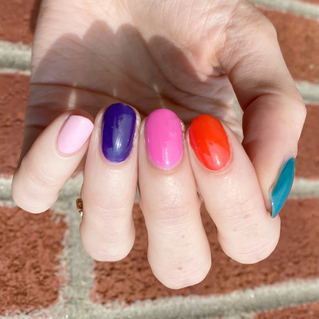
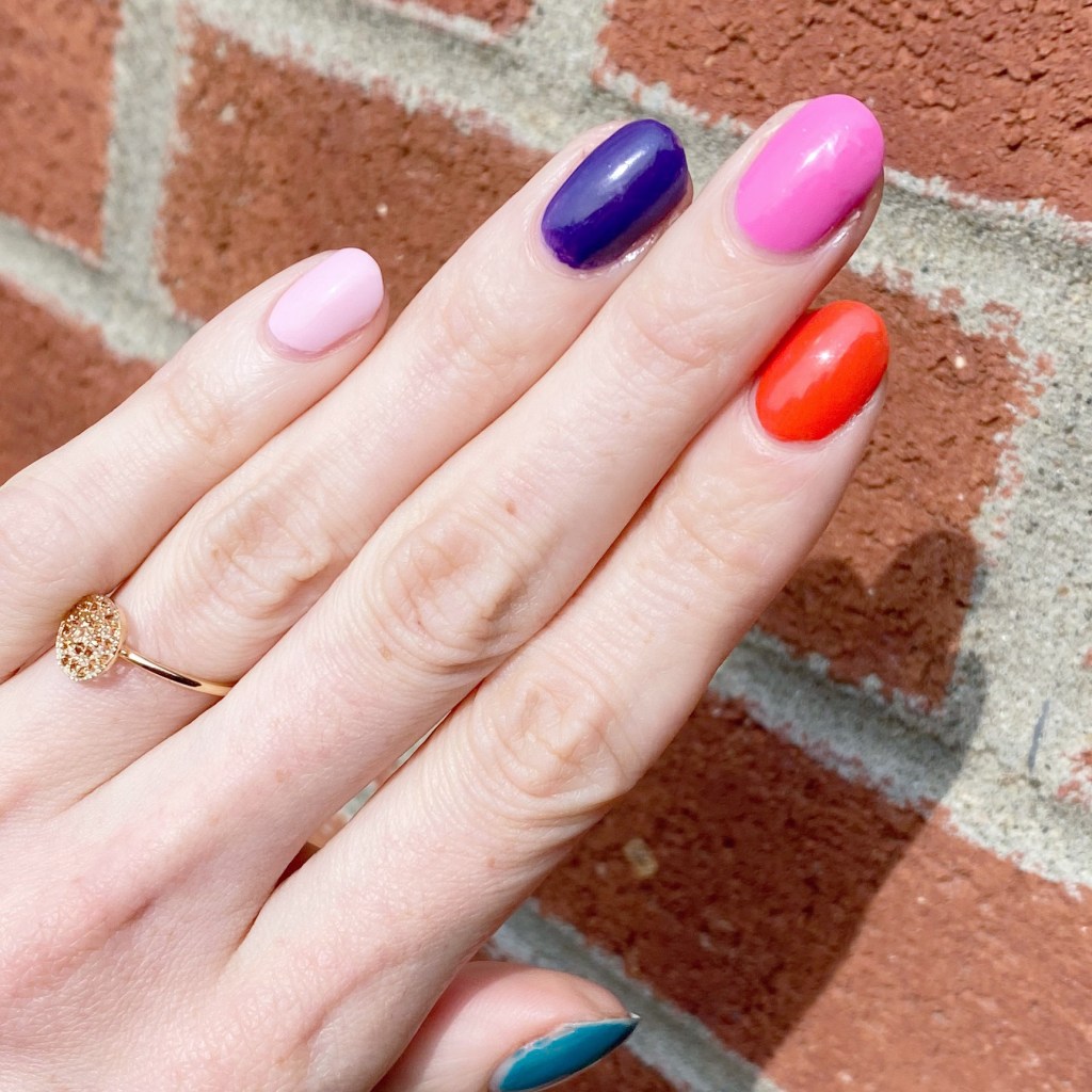
The polishes I used for this manicure are: 

  • Base Coat: Londontown KUR Nail Hardener & Base Coat 
  • Top Coat: Seche Vive Fast Dry Top
  • Thumb — OPI Is That A Spear in Your Pocket (2017 Fiji Collection)
  • Pointer — OPI Living On The Bula-vard (2017 Fiji Collection)
  • Middle — OPI Two Timing The Zones (2017 Fiji Collection)
  • Ring — OPI Do You Have This Color in Stock-holm? (2014 Nordic Collection)
  • Pinky — OPI Getting Nadi on My Honeymoon (2017 Fiji Collection)

I really, really like this combination of colours together. As I’ve mentioned before, I’m always jealous when I did these perfectly coordinated skittle manicures on Instagram because I never feel like mine look as good. This is the first time I’ve done one like this where I’ve been like “yes… perfect!” & I’m so happy about it.

As you can see from my product listing, I used 4 shades from the 2017 Fiji collection, & then one from the 2014 Nordic collection. I really felt like I needed one more darker shade to compliment Is That A Spear in your Pocket? & Do You Have This Color in Stock-holm? was perfect for that! I have so many of these little OPI mini bottles from sets I’ve collected over the years, & I really should reach for them more often.

What do you think of my skittle design? I was this close to adding little white “s” on each nail after my co-worker said they reminded her of berry skittles (we work in a candy store, so it would be very fitting!) but I ended up feeling sick that night & not having the energy to do it. Even still, I absolutely love this colour combination. It just looks so good together.

Have a fantastic Wednesday loves! ♥︎
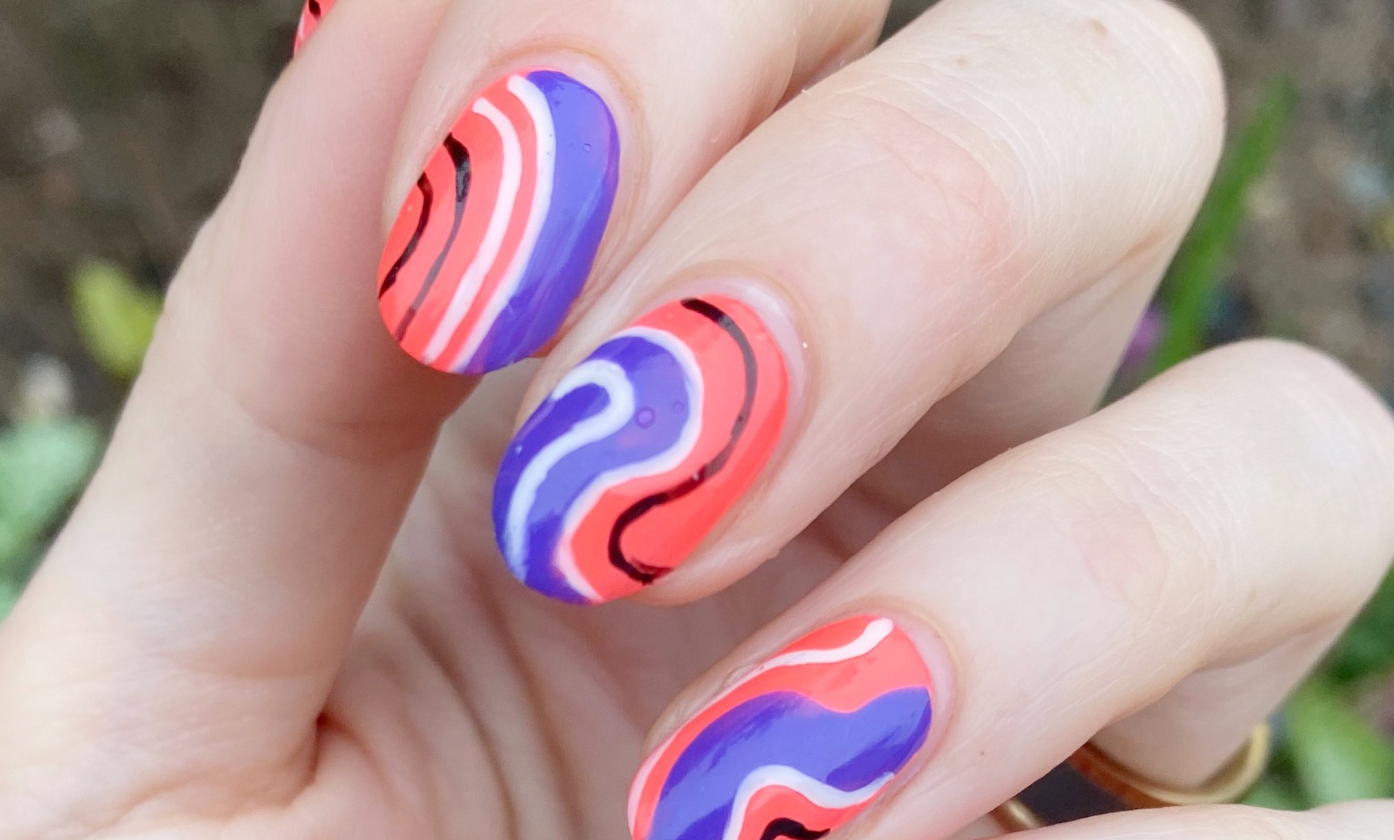
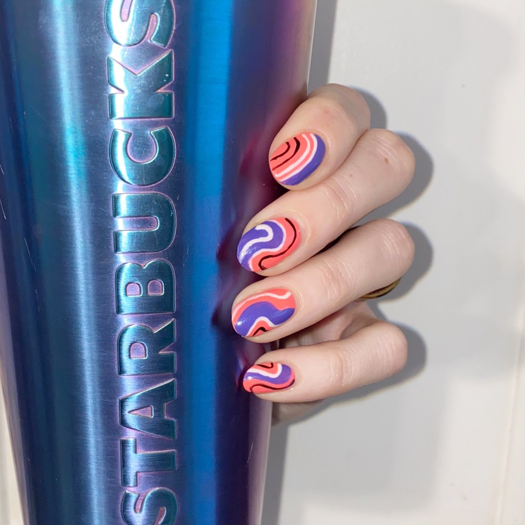
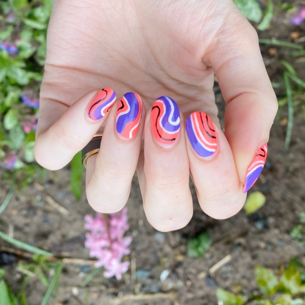
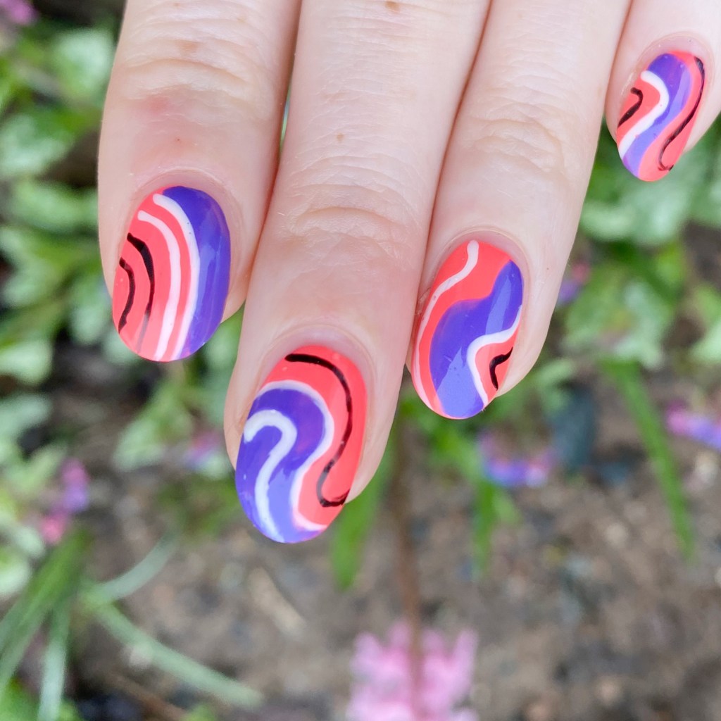
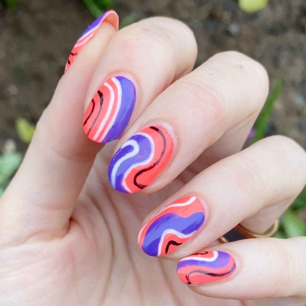
Funky Bright Abstract Stripes

Hello lovelies & happy Wednesday! A beautiful sunny Spring Wednesday.

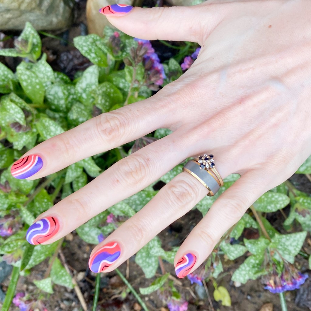
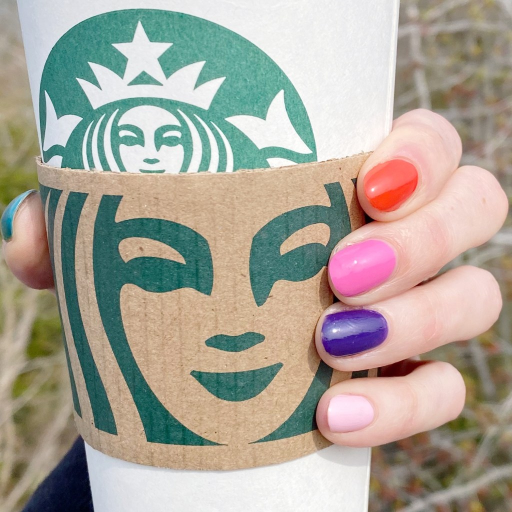
I’ve really been feeling the bright colours lately, so I decided to dig through my stash to see what fun colour combinations I could come up with. Originally I had picked out these colours to do in a moon manicure, but it was late, I was tired & I didn’t want to wait for my base to dry so I decided to do the next best thing! A fun abstract stripe look.

The polishes I used for this manicure are: 

  • Base Coat: Essie Hard To Resist Glow & Shine 
  • Top Coat: Seche Vive Fast Dry Top
  • China Glaze Thistle Do Nicely
  • China Glaze I Got A Blue Attitude
  • Sally Hansen Miracle Gel Blacky-O
  • Sally Hansen Complete Salon Manicure Let’s Snow
  • NailStuff.ca 16mm Striper Brush

I love love love these two colours together, I can’t lie. I’ve always been a fan of pairing purple/corals together. In high school, my bedroom was painted a very vibrant shade of purple, & my curtains were this coral-y orange. & I loved it!

It was the early 2000s… don’t judge haha.

Either way, this is a fun, bright look to show off on a bright & sunny day like today. Of course, when I took these pictures it was not a sunny day… but you know, this kind of look works on a cloudy, rainy day too. Really, I’ll take any excuse for bright nails right now.

What do you think of these fun, funky bright abstract stripes? Are you hearing the call of the Summer neons? I’ll be honest, I bypassed right past pastels & full on into my brightest polish shades, but I’m okay with that!

Have a happy Wednesday!

SWATCH SUNDAY — China Glaze I Got A Blue Attitude

Hello lovelies & happy Sunday! It’s a bright, beautiful sunny Sunday here on the East Coast, & I plan on soaking up all the sunshine today! & maybe pulling out a sun dress too.

A few days ago I did a few Instagram polls to see what kind of polish people wanted to see for this week’s Swatch Sunday. The results were: something from the stash, from a limited collection, & in the blue family. So I dug through my extensive nail polish collection & decided on this beauty: China Glaze I Got A Blue Attitude from the Summer 2016 Lite Brites collection.

2 coats + Seche Vive top coat

The formula on this shade is really nice — it’s thick enough it’s almost a one coated, with perfect application. I went with two, just to make sure I had perfect coverage.

The colour is this beautiful blue leaning purple with subtle, almost hidden, shimmer. You can sort of see it in the bottle below, but I think the thicker formula causes it to be absolutely hidden on the nail itself.

I love how bright this colour is — it really is great for Summer! It’s not really neon, but it’s very bright. If I remember correctly, this was the first shade I bought from the Lite Brites collection because I fell in love with it as soon as I saw it. & even after all the years, I’m still. very much in love with it.

I love a good blue, I love a good purple — so give me a blurple & I’m in heaven!

Sadly, as mentioned, this shade is from the limited edition 2016 Lite Brites collection so it’s not in current rotation — as far as I can see. There does seem to be a few listings on Google for it, so if you’re better at searching for those things than me, you might be able to track it down. But if you happen to come across it on your shopping travels, I definitely recommend picking it up, because it is a very beautiful colour!

What do you think of China Glaze I Got A Blue Attitude? Do you love this shade? Let me know down in the comments below.

Have a lovely Sunday. 💜

Easy Pop Art Nail Art with Stickers

Hello lovelies! I hope everyone is having a lovely week so far. Today I’m feeling Summer vibes, so I wanted to share a fun pop art inspired nail art I recently did that were super easy to do — especially since they basically involve no actual talent what-so-ever! & isn’t that the best kind of nail art?

The polishes I used for this manicure are: 

  • Base Coat: Essie Hard To Resist Glow & Shine 
  • Top Coat: Seche Vive Fast Dry Top
  • Holographic Top Coat: Starrily Eclipse
  • Essie In The Cabana
  • Olive & June Nail Art Stickers (discontinued sheet)

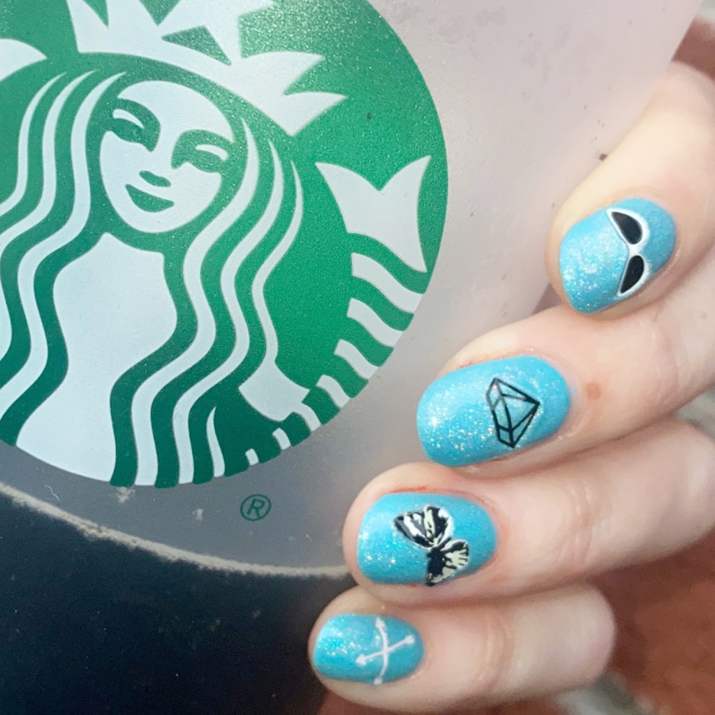
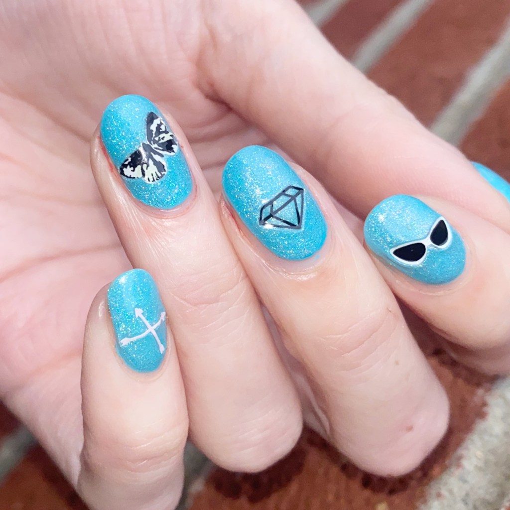
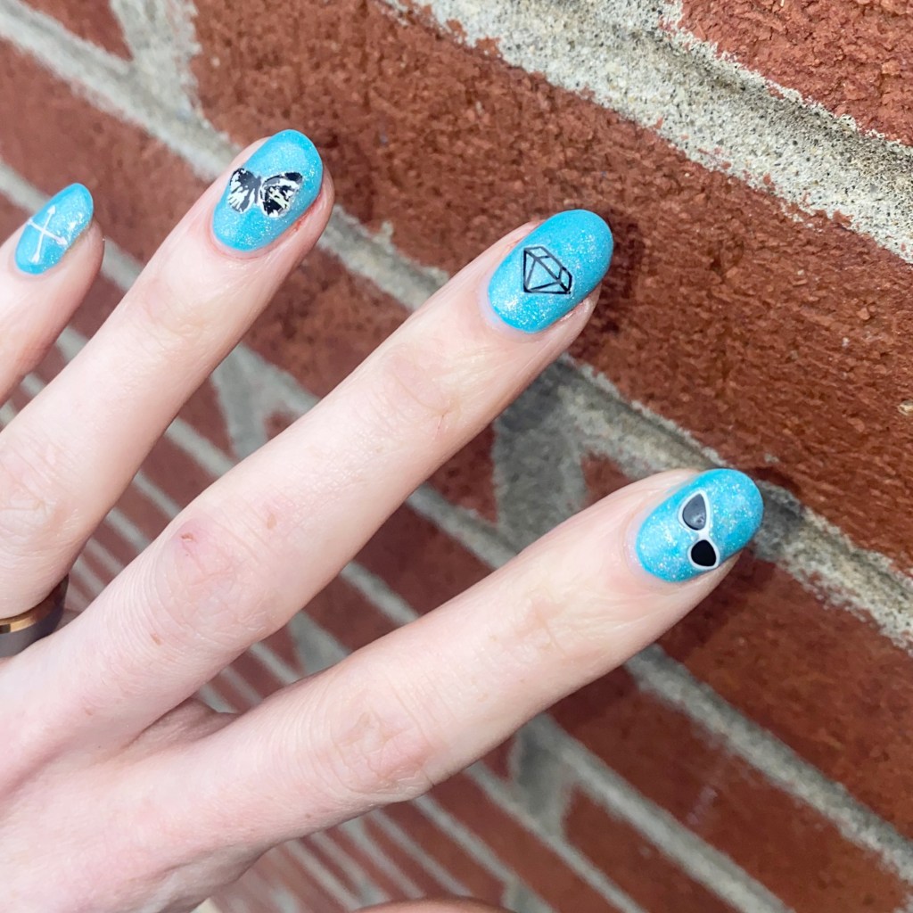
I recently picked up (well… last Summer) a new bottle of Essie In the Cab-ana which is one of my favourite Summer shades. But adding Starrily Eclipse over top brought it to a whole other level! & I’m definitely obsessed.

I also thought these Olive & June nail art stickers were so cute over top. The black & white stickers feel very pop art to me. This sticker line is long discontinued (I think it’s about 5 years ago I was gifted them) but they do have lots of other cute nail art stickers on their site. You can also find cute nail art stickers through my go to, NailStuff.ca, Deco Miami — although I’ve never tried them — & Amazon, obviously!

What do you think about these fun nail art looks? Do you like easy nail art looks like this?

Let me know all your thoughts down in the comments below.

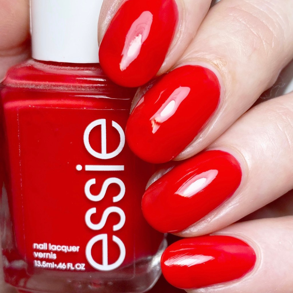
SWATCH SUNDAY — Essie Too Too Hot ❤️‍🔥

Hello lovelies & happy Sunday!

It’s been a beautiful balmy week this week (at least in terms of our usual April days) so I’m feeling all the Summer vibes I can handle. I even broke out my favourite holo sandals. So with these beautiful Summery days, I felt like switching gears from pastel vibes to full on Summer with a classic Essie shade: Essie Too Too Hot.

This shade was originally released circa 2011 as part of the Braziliant Summer 2011 collection ( found swatches online of the full collection here).

3 coats + Seche Vive Top Coat

I ended up with 3 coats of polish for my swatches, which I feel like was a bit too much, but I the formula was a bit on the thinner side, so I found I needed to do a lot less polish on the brush to avoid flooding my cuticles.

The colour is this beautiful mix between a bright tomato red, & a coral, although in my photos it’s definitely leaning more towards the red side. That could also be due to the fact my skin tone leans more on the yellow/olive side, so I feel like that brights out the red tones more.

We all know I love a good red nail polish, & I love an Essie red even more! It’s actually surprising how few Essie reds I have in my stash, so I think I need to fix that.

This shade is beautiful though, because I find it would be pretty universally flattering on a lot of skin tones. It reminds me a bit of Sally Hansen Cherry Delightful from their RED/ESIGN collection from a few years ago, which was designed to compliment everyone. So this definitely seems like a red that anyone could wear.

Sadly, this shade has been discontinued from the Essie core line, which makes me really sad because I think everyone needs a classic flattering red in their collection. Red nails make everything better (which is why I spent the majority of my early 20s rocking some shade of red.) So I would totally be down with championing a petition for Essie to bring this beauty back to their core line!

What do you think of this beauty? Do you own Essie Too Too Hot in your nail polish stash? What is your favourite Essie red? Let me know in the comments below.